MTA Post-Covid Recovery Dashboard

| DESCRIPTION | Investigating an MTA ridership dataset to gain insight on the post-covid recovery trends of its various modes of public travel |
| TOOLS | Databricks SQL, RStudio, Shiny, Blender 3D |
| PROJECT_TYPE | Data cleaning, Data manipulation, Data analysis, Data visualization, Trend Analysis, Shiny dashboard development |
| LINKS | Maven Commuter Challenge, Dashboard, Github Repo |

Many lives and industries were disrupted by the COVID-19 pandemic. The Metropolitan Transport Authority (MTA) was not spared, so the goal of this project was to play the role of a Data Visualization Specialist for the Analytics Team and investigate how the MTA’s various transport modes were affected as well as how they have been recovering in comparison to their pre-pandemic ridership/use.
I also saw this as an opportunity to dip my toes into Shiny and dashboard development, so I searched for a template I could work with that was at a level I was aiming to rise to through diving straight into working with it and figuring things out as I go. Appsilon does an amazing job of developing apps with Shiny that don’t look like they were made with it, and they’re Enterprise dashboard had great bones
 The dataset was explored using Databricks SQL where I first visualised each mode individually to see how it performed, and then mapped them all onto the same line chart to see how they compared. I wrote a short paragraph for each mode summarising
Most of the data wrangling for the dataset was already done, but a fair bit of attention was needed transform the table into a suitable format for the Shiny app. The trick was to pivoting the table and using a series of LAG() window functions to define variables for previous month/year filters as well as their percentage deltas. COALESCE() was also needed to force ‘NA’ as an entry where there would otherwise be a zero or NULL.
Here’s a typical example of a column:
  -- Previous month ridership recover rate
  CASE
    WHEN `ridership_type` = "postpandemic" THEN
      COALESCE(
        CAST(ROUND(LAG(ridership_recover_rate, 30) OVER (
          PARTITION BY ridership_mode, ridership_type ORDER BY `date`
      ), 0) AS INTEGER), 'NA'
    )
    ELSE 'NA'
    END AS `ridership_recover_rate.prev_month
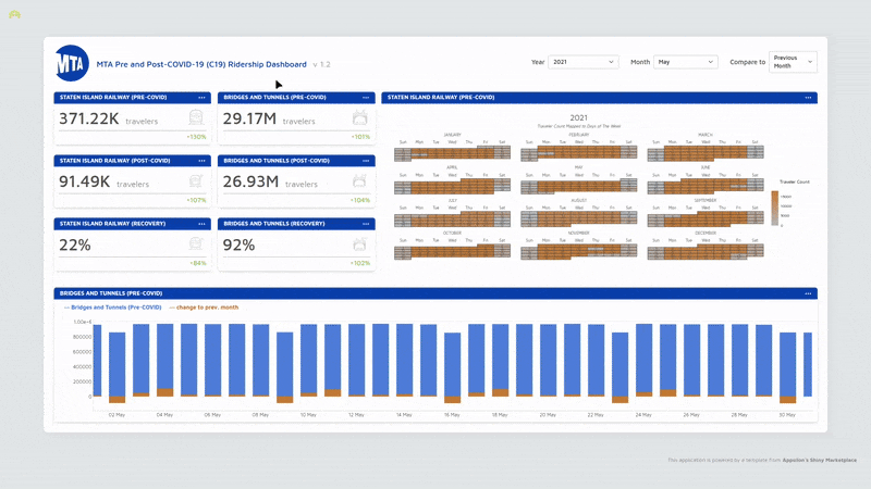
This resulted in a really wide table, but this also meant that the data was more granular. Doubling-up on the metric cards made it possible to compare two modes of transport at the same time while cycling through different periods.
Admittedly, this could have been improved by adding a visual component like a simple line chart that would make it easier to note any potential intersections that the numeric metric cards couldn’t highlight.

Staten Island Railway (SIR) was the most affected, being the one mode that had not recovered back to pre-COVID ridership levels. This is was a result of a number of things:
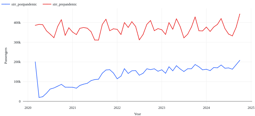
2020 ridership saw a 43% sharp decline at the onset of the pandemic, with a low and slow recovery for the remainder of the year, only regaining 19% of pre-pandemic ridership.
More of the same was observed in 2021, overall recovery for the year growing 11% from 2020. It also note-worthy that seasonal fluctuations very rarely mirror pre-pandemic patterns. This could be the result in a strong shift in the public’s traveling habits using this mode of transport, but this begins to change in 2022 with recovery steadily continuing to regain 10% of pre-pandemic figures.
Average recovery halves in 2023, and only goes up by 1% in 2024, signaling a halt that suggests a long-term shift in the public’s use of this mode of transport.
 Part of the reason why I chose an already-assembled dashboard to work with for this project had to do with simulating entering a work environment that had its own way doing things. It would be up to me to get my bearings and complete the task at-hand.
A lot of the insights for this project were actually found on the website rather than in the data itself. I was able to identify when disruptions occurred and the rate of ridership recovery, but knowing that this was also attributed to maintenance and infrastructure updates would have been helpful if it was made available in the dashboard itself via something like a tooltip when hovering over a day on the heatmap calender - and then having that link to the full report elsewhere.
If I were to do this project again I definitely put more care into that heatmap, choosing a package that supported interactivity so I could include additional information.
Overall, I’m proud of what I accomplished with this project. It got really hairy in a few places trying to tame the template, but I got to learn so much throughout the process. I had never created my own function before this project, and I had to create one make the numbers and some of the figures more readable and context-sensitive. I got really familiar with CSS using resources like MDN’s library of examples when I often hit a wall with Chat-GPT because I hadn’t yet learned the correct term for what I needed to learn more about.
comments powered by Disqus