Sensor 21

This was a quick study using a dataset of an air quality survey in Dawncliffe, Durban. It was conducted in 2018. The final product was an hypothetical electronic sensor device that could have been used in capturing/generating the data used in the exercise.
R Programming 101’s framework for exploratory data analysis covered in their series of videos was used to methodically interrogate the data .
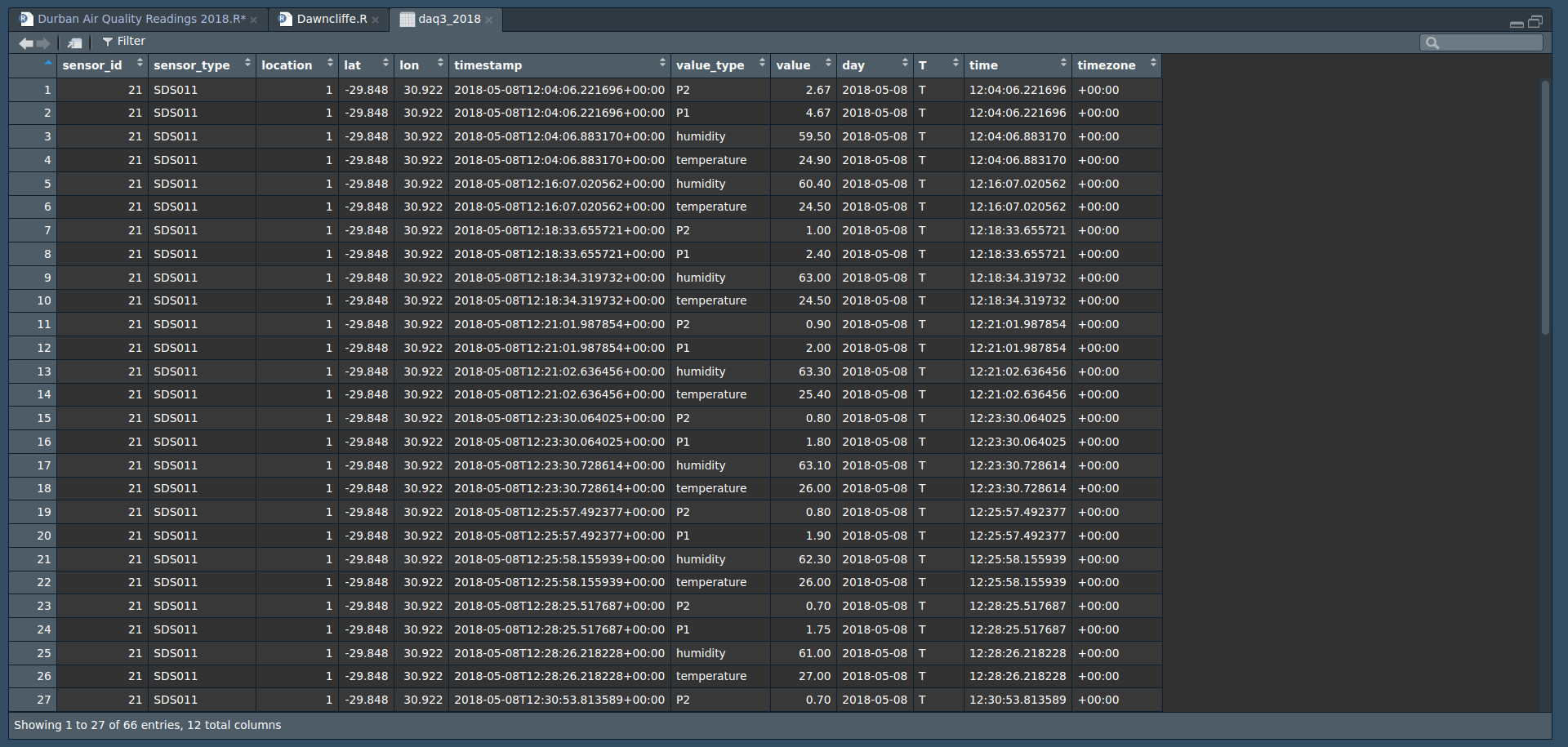
The EDA started by downloading and bringing the dataset in to the project with the name “daq2018”.
daq2018 <- read.csv("/home/afrikaniz3d/Documents/Durban Air Quality Data Exploration/datasets/may_2018_sensor_data_archive.csv")
The first task used glimpse() for first impressions.
> glimpse(daq2018)
Rows: 66
Columns: 8
$ sensor_id   <int> 21, 21, 21, 21, 21, 21, 21, 21, 21, 21, 21, 21, 21, 21, 21, 21, 21, 21, 21, 21, 21, 21, 21, 21, 21, 21, 21, 21, 21, 21, 21, 21, 21,…
$ sensor_type <chr> "SDS011", "SDS011", "SDS011", "SDS011", "SDS011", "SDS011", "SDS011", "SDS011", "SDS011", "SDS011", "SDS011", "SDS011", "SDS011", "…
$ location    <int> 1, 1, 1, 1, 1, 1, 1, 1, 1, 1, 1, 1, 1, 1, 1, 1, 1, 1, 1, 1, 1, 1, 1, 1, 1, 1, 1, 1, 1, 1, 1, 1, 1, 1, 1, 1, 1, 1, 1, 1, 1, 1, 1, 1,…
$ lat         <dbl> -29.848, -29.848, -29.848, -29.848, -29.848, -29.848, -29.848, -29.848, -29.848, -29.848, -29.848, -29.848, -29.848, -29.848, -29.8…
$ lon         <dbl> 30.922, 30.922, 30.922, 30.922, 30.922, 30.922, 30.922, 30.922, 30.922, 30.922, 30.922, 30.922, 30.922, 30.922, 30.922, 30.922, 30.…
$ timestamp   <chr> "2018-05-08T12:04:06.221696+00:00", "2018-05-08T12:04:06.221696+00:00", "2018-05-08T12:04:06.883170+00:00", "2018-05-08T12:04:06.88…
$ value_type  <chr> "P2", "P1", "humidity", "temperature", "humidity", "temperature", "P2", "P1", "humidity", "temperature", "P2", "P1", "humidity", "t…
$ value       <dbl> 2.67, 4.67, 59.50, 24.90, 60.40, 24.50, 1.00, 2.40, 63.00, 24.50, 0.90, 2.00, 63.30, 25.40, 0.80, 1.80, 63.10, 26.00, 0.80, 1.90, 6…
>
At a glance I could tell a few things:
- The readings are taken using the same sensor, at the same location on the 8th and 18th of May 2018
- P1, P2, Humidity, and Temperature readings were recorded periodically
- The first five (5) variables could be disregarded for the rest of this exercise as they were control figures that did not change.
unique(daq2018$value_type)
[1] "P2"          "P1"          "humidity"    "temperature"
>
The unique() command was used to check that there were no duplicates/misspellings, or extra variables where there was a known limit. This also confirmed the number of value_types listed earlier.
> names(daq2018)
[1] "sensor_id"   "sensor_type" "location"    "lat"         "lon"         "timestamp"   "value_type"  "value"
>
One of the things I had some repeated trouble with during the course of this exploration was correctly formatting the date/time component to use in transition-through-time plots. As short as this dataset is it still offered some challenges.
The first few goes around the dataset involved trying different methods to get the time component in the ideal variable class. This was done using the separate() function in the timestamp variable. Three (3) new columns would be generated: date, time, and timezone.
daq1_2018 <- daq2018 %>%
  separate(timestamp2,
           into = c("day", "time"),
           sep = 10)

# next, remove the "T"

daq2_2018 <- daq1_2018 %>%
  separate(time,
           into = c("T", "time"),
           sep = 1)

# finally, remove the timezone at the end

daq3_2018 <- daq2_2018 %>%
  separate(time,
           into = c("time", "timezone"),
           sep = 15)
The chunks above gave variables that were easier to manage, whilst preserving the original formatting.
I then used the class() function to identify/confirm the variables’ classes. Both were still character - as per the original timestamp variable.
class(daq3_2018$day)
[1] "character"
> class(daq3_2018$time)
[1] "character"
A new column, moment, was then created using unite(). This was then followed by reclassifying the re-formed variable.
daq4_2018$moment <- as.POSIXct(daq4_2018$moment,
                                 format = "%Y-%m-%d %H:%M:%S",
                                 optional = FALSE)
View(daq4_2018)
Although the chunk above was successful in changing the class, it also shaved off some decimal places in the readings. Because these were fractions of a second I thought it alright for this exercise to disregard them and continue as I was not able to go online at the time to find a tutorial. This can be something I remedy in future explorations.
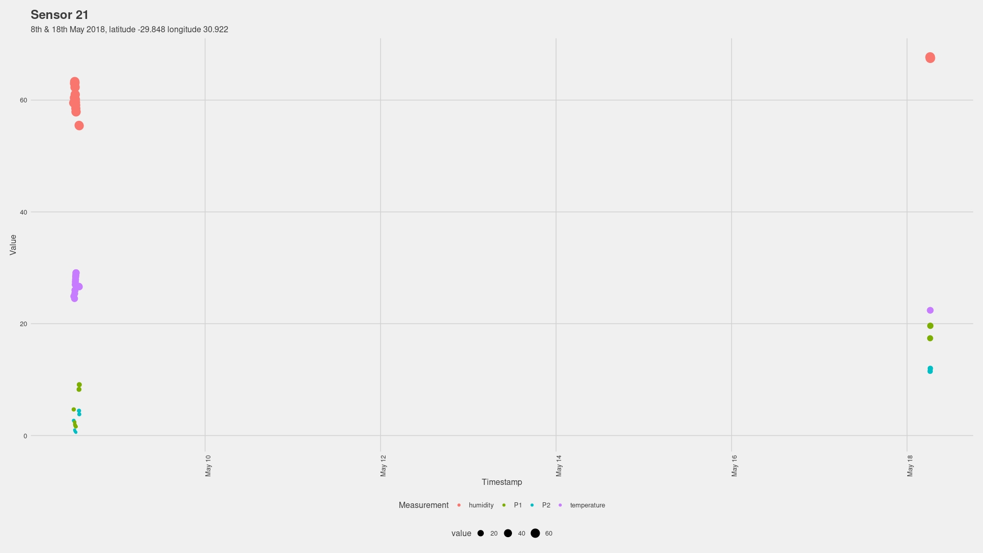
The plot above generated highlighted a few things. Its legibility is decreased by the plot combining the readings from the two separate days, thus shrinking the observations to fit. The plot below is the same plot with the exception of using the character-class timestamp rather than the POSIX-class moment
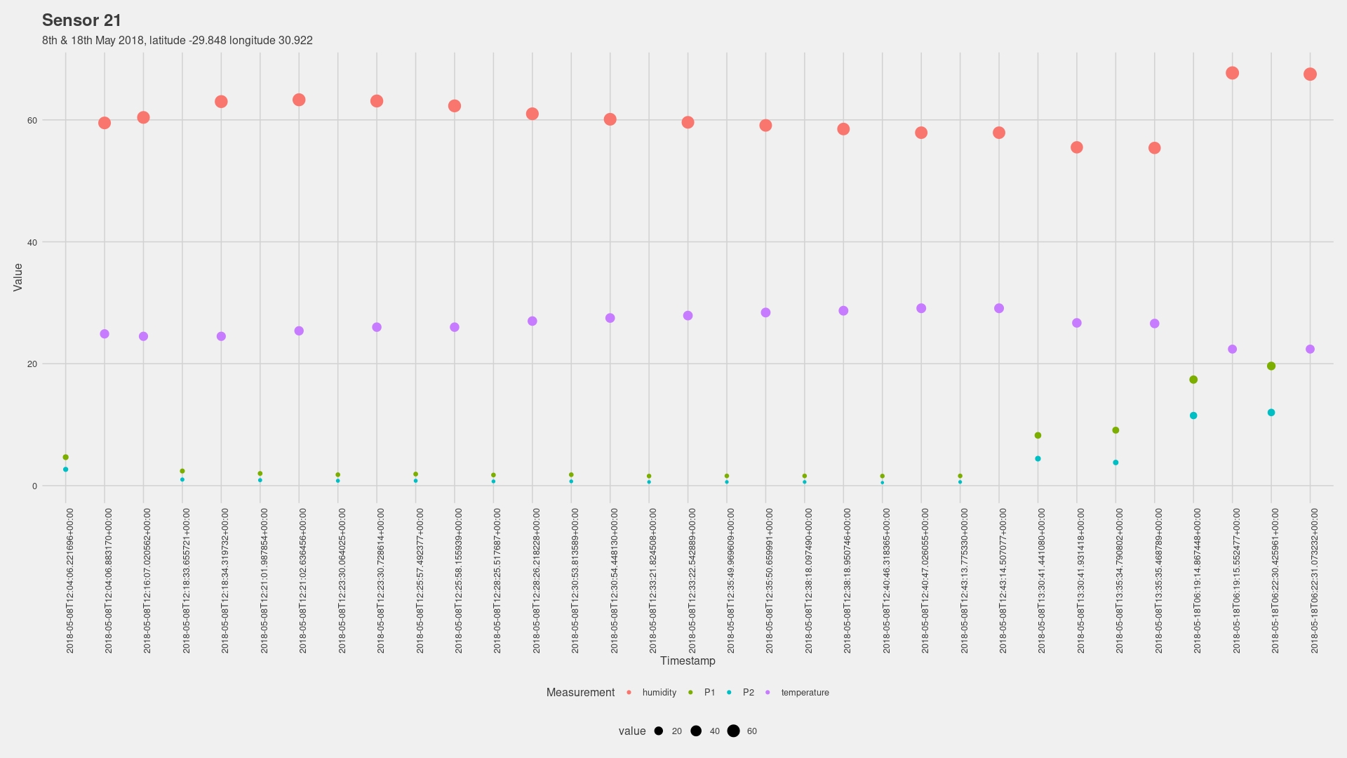
I chose to separate the data frame into two (2) to help simplify the steps when calculating, and also to hopefully avoid issues such as R filling in the days in-between to create a flowing time series animation.
There was a slight rise in humidity and temperature at the start - to be expected given the time of day - and then slowly declined.
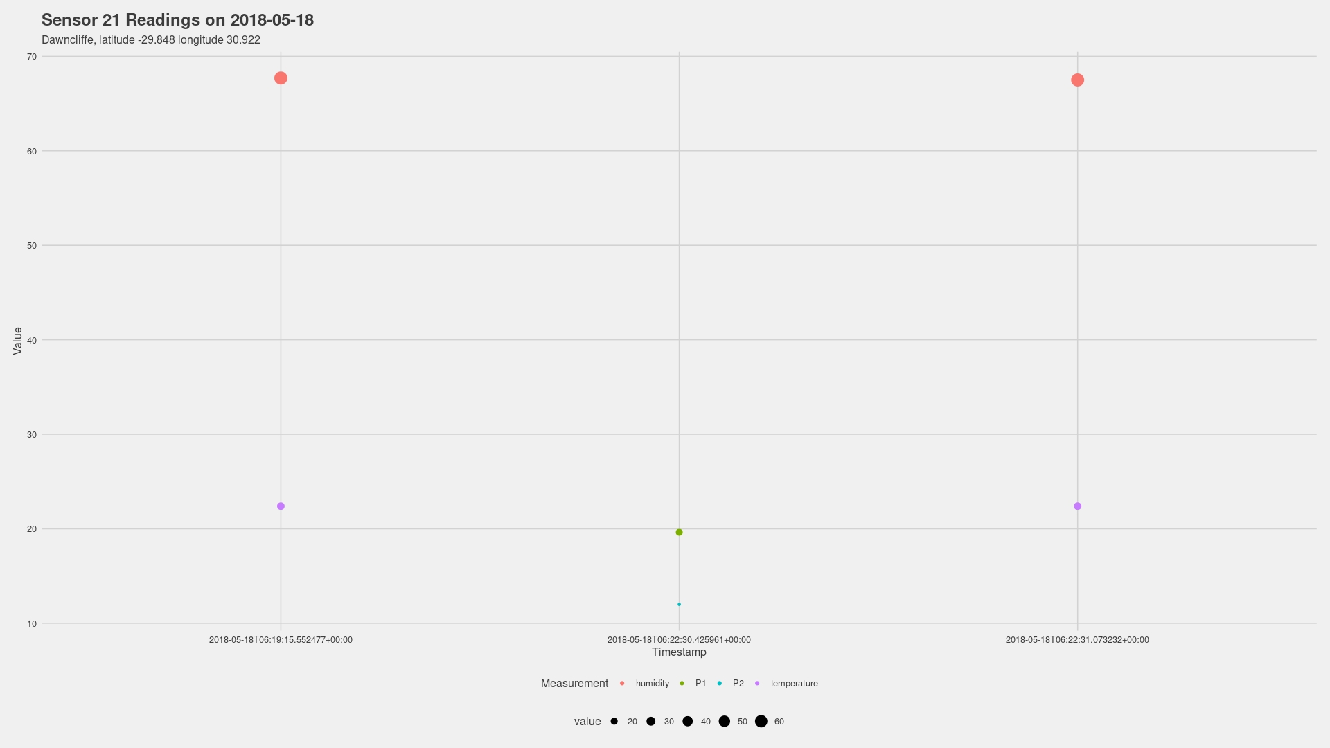
The second day had fewer measurements, but the observations showed that the readings for P1 and P2 were much higher than the ones taken on the first day.
When it comes to speculating about the causes - without more information about the area or events that day, my best guesses for the spiking in P1 and P2 values (better seen two images up) would be the result of an increase in motor vehicle emissions during the lunchtime rush, or a factory nearby was outputting waste that the sensor was testing for.
Without more information about the survey and the reason for it being carried out there is little else I can comment on. What also makes it difficult to marry the two is that they are recorded at different periods of the day when there are different types and volumes of traffic and activity.
The second leg of this project moved to Blender where I wanted to introduce a 3D component to the exploration. Although the initial guess at what this would look like would have been more focused on a 3D representation of the data, I instead opted to choose the physical device component as this is something I could take further by designing a hypothetical device that could contribute to digital asset packs - HEXES Mini Pack 04: Electronic Devices is already available to purchase if you’d like to support my work. New assets are added periodically, and customers get to suggest pieces for future updates.
Sensor 21 is a palm device with the capacity to show reading timelapses on the small LCD screen. The screen was made using geometry nodes and the results look really good - at the cost of performance… :D
The chunk below shows the lines of code I used to generate the graphs along with some notes on the results.
# Systematic Breakdown of this Analysis will follow the steps below:
# Explore
# Clean
# Manipulate
# Describe
# Visualise
# Analyse
# Loading the packages that will be used in the exploration
library(tidyverse)
library(dplyr)
library(ggplot2)
library(gganimate)
library(ggthemes)
library(gifski)
# Step 01: Bringing in the Dataset
# The name "daq_2018 is chosen to represent "Dawncliffe Air Quality 2018"
daq2018 <- read.csv("/home/afrikaniz3d/Documents/Durban Air Quality Data Exploration/datasets/may_2018_sensor_data_archive.csv")
# Use glimpse() to inspect the dataset
glimpse(daq2018)
# Go through each variable with unique() to confirm there are no duplicates for any reason (such as misspelling)
unique(daq2018$sensor_id)
unique(daq2018$sensor_type)
unique(daq2018$location)
unique(daq2018$lat)
unique(daq2018$lon)
unique(daq2018$timestamp)
unique(daq2018$value_type)
unique(daq2018$value)
# All is fine. The next task is working with the date and time column. Before doing anything else, I create a duplicate "timestamp2" to work with
daq2018$timestamp2 <- daq2018$timestamp
# Now to separate the newly-created column
daq1_2018 <- daq2018 %>%
separate(timestamp2,
into = c("day", "time"),
sep = 10)
# Repeat to remove the "T"
daq2_2018 <- daq1_2018 %>%
separate(time,
into = c("T", "time"),
sep = 1)
# One more time to shed the timezone at the end
daq3_2018 <- daq2_2018 %>%
separate(time,
into = c("time", "timezone"),
sep = 15)
# Identify/confirm the class types of the above variables
class(daq3_2018$day)
class(daq3_2018$time)
# Uniting the two components and setting the correct class
daq4_2018 <- daq3_2018 %>%
unite(col = moment,
day, time,
sep = " ")
daq4_2018
# Making "moment" a date/time class
daq4_2018$moment <- as.POSIXct(daq4_2018$moment,
format = "%Y-%m-%d %H:%M:%S",
optional = FALSE)
View(daq4_2018)
# Generates a POSIX class, but shaves off the fractions of a second in the readings
# I haven't been able to find a way to preserve them and, since they are so small,
# I will disregard them to keep things moving and circle back to them when I'm online again to find a tutorial
# sprintf() might be the solution
# Time to produce the first plot
daqgraph = daq4_2018
daqgraph %>%
ggplot(aes(x = moment, y = value, colour = value_type, size = value)) +
geom_point() +
labs(title = "Sensor 21",
subtitle = "8th & 18th May 2018, latitude -29.848 longitude 30.922",
x = "Timestamp", y = "Value", colour = "Measurement") +
theme_fivethirtyeight() +
theme(axis.title = element_text(), axis.text.x = element_text(angle = 90))
daqgraph
# Sorting by day should hopefully make the plots more readable
# Before that, I must show what the plot looks like using the character class timestamp variable
daqgraph = daq4_2018
daqgraph %>%
ggplot(aes(x = timestamp, y = value, colour = value_type, size = value)) +
geom_point() +
labs(title = "Sensor 21",
subtitle = "8th & 18th May 2018, latitude -29.848 longitude 30.922",
x = "Timestamp", y = "Value", colour = "Measurement") +
theme_fivethirtyeight() +
theme(axis.title = element_text(), axis.text.x = element_text(angle = 90))
daqgraph
# Much more legible!
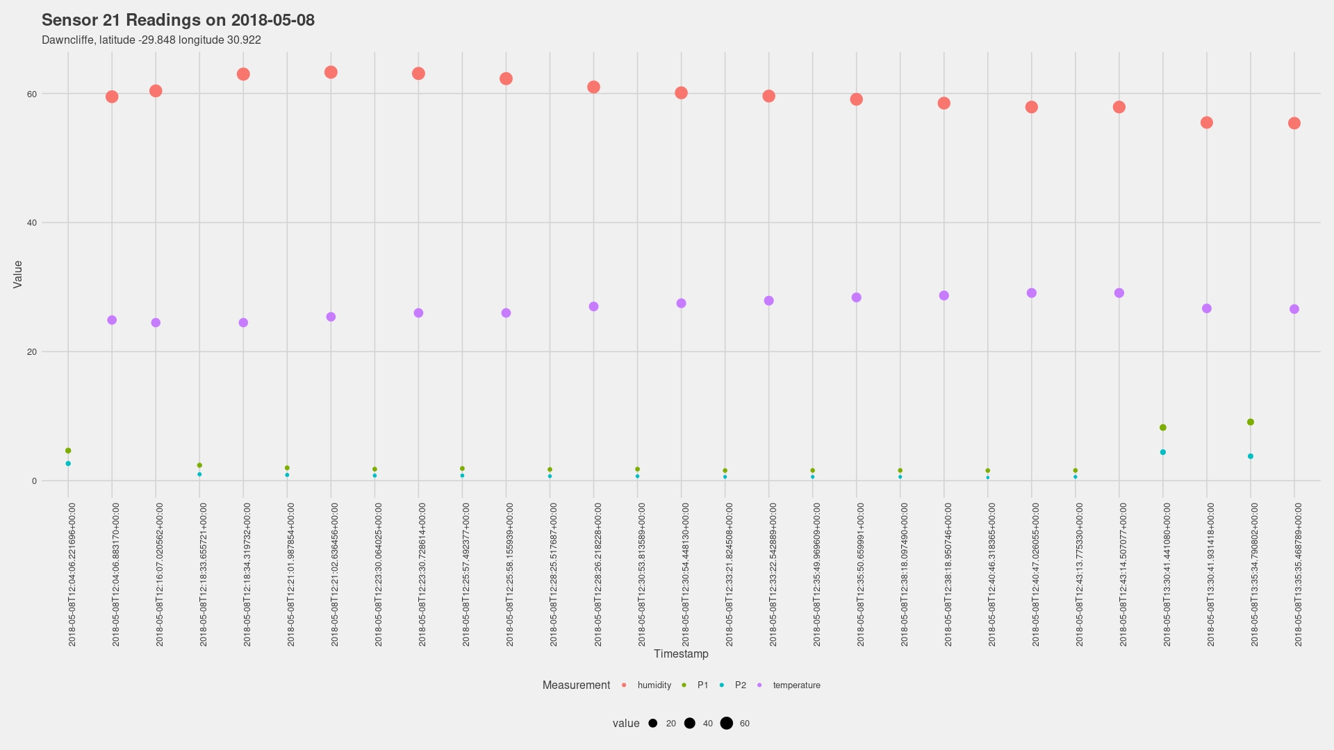
daq_05082018 <- slice_head(daq4_2018, n = 58)
daq_05182018 <- slice_tail(daq4_2018, n = 6)
# Recreating the first plots for the two separate days
# 8 May 2018
daq0508graph = daq_05082018
daq0508graph %>%
ggplot(aes(x = timestamp, y = value, colour = value_type, size = value)) +
geom_point() +
labs(title = "Sensor 21 Readings on 2018-05-08",
subtitle = "Dawncliffe, latitude -29.848 longitude 30.922",
x = "Timestamp", y = "Value", colour = "Measurement") +
theme_fivethirtyeight() +
theme(axis.title = element_text(), axis.text.x = element_text(angle = 90))
daq0508graph
# 18 May 2018
daq0518graph = daq_05182018
daq0518graph %>%
ggplot(aes(x = timestamp, y = value, colour = value_type, size = value)) +
geom_point() +
labs(title = "Sensor 21 Readings on 2018-05-18",
subtitle = "Dawncliffe, latitude -29.848 longitude 30.922",
x = "Timestamp", y = "Value", colour = "Measurement") +
theme_fivethirtyeight() +
theme(axis.title = element_text(), axis.text.x = element_text(angle = 0))
daq0518graph
# Generating an animated time series plot of the second day
daq0518.animation = daq0518graph %>%
ggplot(aes(x = timestamp, y = value, colour = value_type, size = value)) +
geom_point() +
labs(title = "Sensor 21 Readings on 2018-05-18",
subtitle = "Dawncliffe, latitude -29.848 longitude 30.922",
x = "Date / Time", y = "Value", colour = "Measurement") +
theme_fivethirtyeight() +
theme(axis.title = element_text(family = "Rubik"),
legend.text = element_text(size =11), axis.text.x = element_text(angle = 90)) +
scale_color_brewer(palette = "Set2") +
transition_time(moment) +
labs(subtitle = "Timestamp : {frame_time}") +
shadow_wake(wake_length = 4)
daq0518.animation
# Code above created a blinking result
daq0508.animation = daq0508graph %>%
ggplot(aes(x =as.character.Date(timestamp), y = value, colour = value_type, size = value, ggp)) +
geom_point() +
labs(title = "Sensor 21 Readings on 2018-05-08",
subtitle = "Dawncliffe, latitude -29.848 longitude 30.922",
x = "Time", y = "Value", colour = "Measurement") +
theme_fivethirtyeight() +
theme(axis.title = element_text(family = "Rubik"),
legend.text = element_text(size =11), axis.text.x = element_text(angle = 90)) +
scale_color_brewer(palette = "Set2") +
transition_time(moment) +
labs(subtitle = "Timestamp : {frame_time}") +
shadow_wake(wake_length = 2.3)
animate(daq0508.animation, height = 1080, width = 1920,
fps = 60, duration = 6, end_pause = 90, res = 100)
# Final render of the shorter survey also has the blinking issue
# But at least it shows the climb of P1 and P2
# Line graph for 8 May
daq0508linegraph = daq_05082018
daq0508linegraph %>%
ggplot(aes(x = moment, y = value, colour = value_type)) +
geom_line(size = 1) +
labs(title = "Sensor 21 Readings on 2018-05-08",
subtitle = "Dawncliffe, latitude -29.848 longitude 30.922",
x = "Timestamp", y = "Value", colour = "Measurement") +
theme_fivethirtyeight() +
theme(axis.title = element_text(), axis.text.x = element_text(angle = 0))
daq0508linegraph
# Line graph for 18 May
daq0518linegraph = daq_05182018
daq0518linegraph %>%
ggplot(aes(x = moment, y = value, color = value_type)) +
geom_line(size = 1) +
labs(title = "Sensor 21 Readings on 2018-05-18",
subtitle = "Dawncliffe, latitude -29.848 longitude 30.922",
x = "Timestamp", y = "Value", colour = "Measurement") +
theme_fivethirtyeight() +
theme(axis.title = element_text(), axis.text.x = element_text(angle = 0))
daq0518linegraph
This wraps up the first experiment in case study projects. I got to work a lot on the wrangling side of the data when I was trying to transform the time component into the correct format.
Thank you for taking a look. If you have any suggestions for how I could have approached this differently or solutions for any issues listed above, I wouldn’t mind hearing from you.
comments powered by Disqus