X-Men Mutant Moneyball

| DESCRIPTION | Analysing comic book sales data to inform a moneyball draft for a team of mutants from the X-Men property |
| TOOLS | MySQL, RStudio, Quarto, JavaScript, HTML, CSS |
| PROJECT_TYPE | Data cleaning, Data manipulation, Data analysis, Data visualization, Trend Analysis, Machine Learning, Quarto Report Writing |
| LINKS | Tidy Tuesday 2024-12, Github Repo |

The goal of this project was to create a tool that gamified the process of selecting mutants through a moneyball. The gamification was to take the form of a tool that took the sales and pricing figures and present them in a manner more familiar to gamers, typically found in visualizations such as a Pokédex.
It’s important to note that the tool’s intention was not to make/propose definitive recommendations, but to provide the user an interface to perform direct comparisons between mutants under a small variety of conditions.
1.1 Understanding what a Moneyball is
Prior to this project I had no concept of what a moneyball was, guessing that it may be related somehow to a type of lottery or gameshow. Looking into this first would help provide some guardrails for navigating the data.
A moneyball described as “the use of metrics to identify ‘undervalued players’ and sign them to what ideally will become ‘below market value’ contracts; it began as an effort by small-market teams to compete with the much greater resources of big-market ones.” – Wikipedia.
1.2 Creating the mutant selection aid
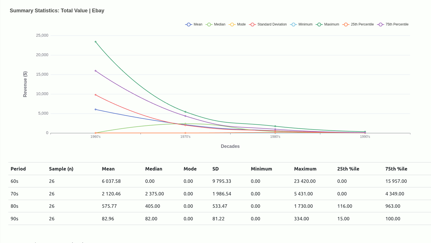
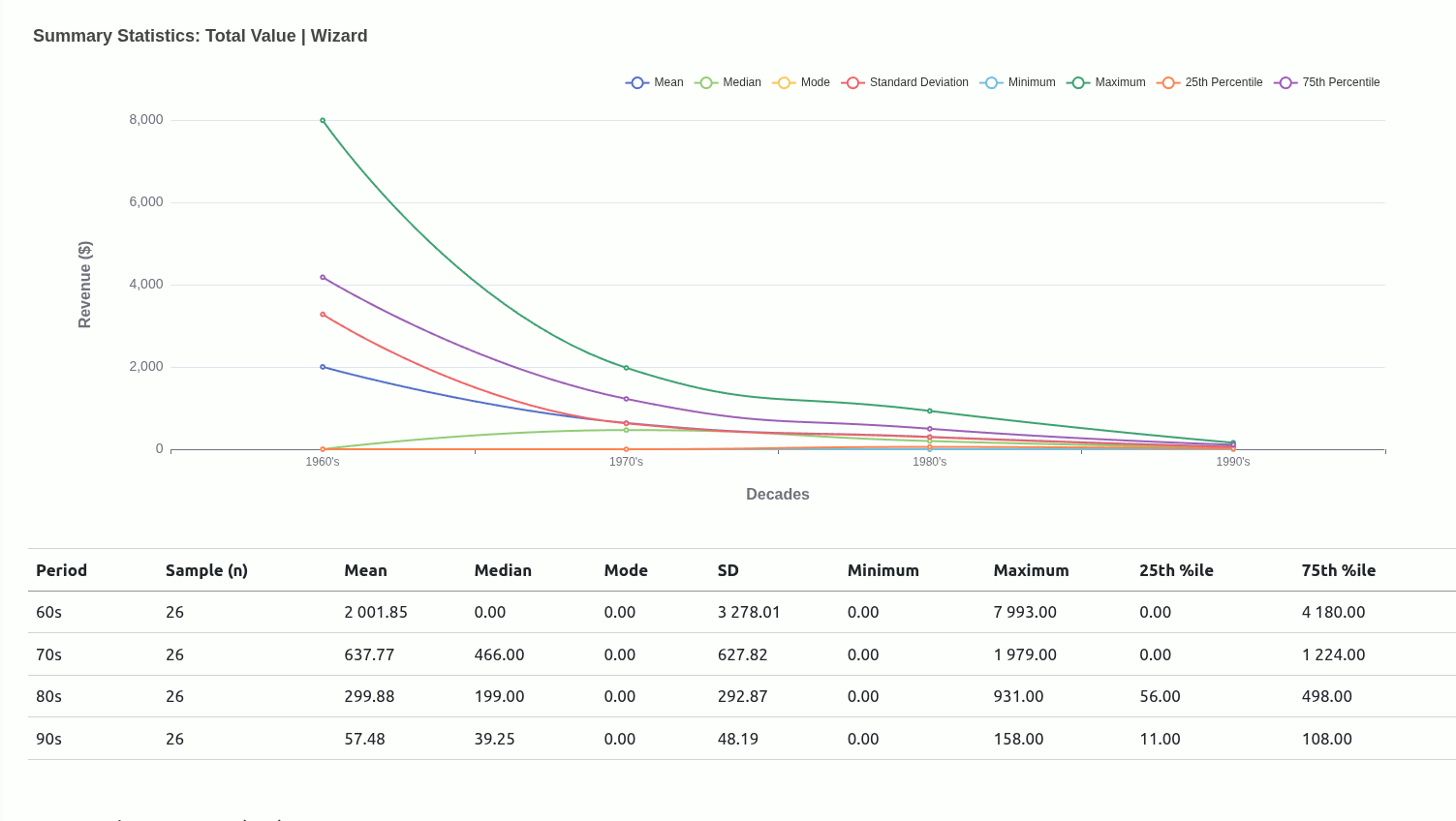
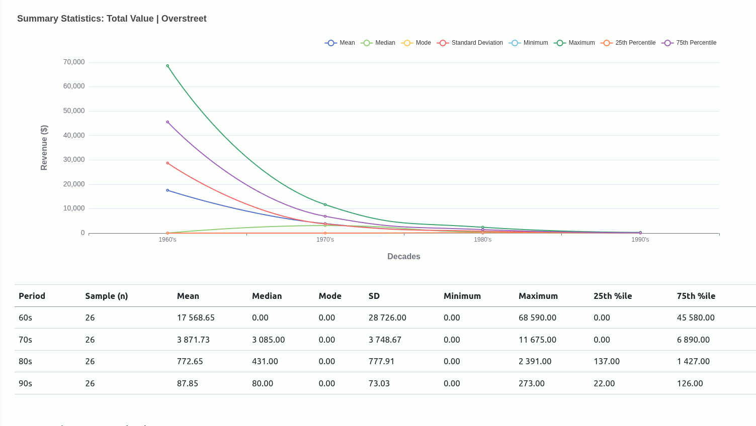
After looking at the raw data, I chose to focus on basing my use of the metrics only on revenue and secondarily on the value of a single issue as a unit price for each mutant. Rather than coming up with definitive picks, my focus is to present the tabular data in a way that makes it easier to visually compare potential match-ups by looking at mutants’ performances in the different outlets.

The initial exploration of the data was carried out in MySQL, and this is also where the final tables for visualization were generated.
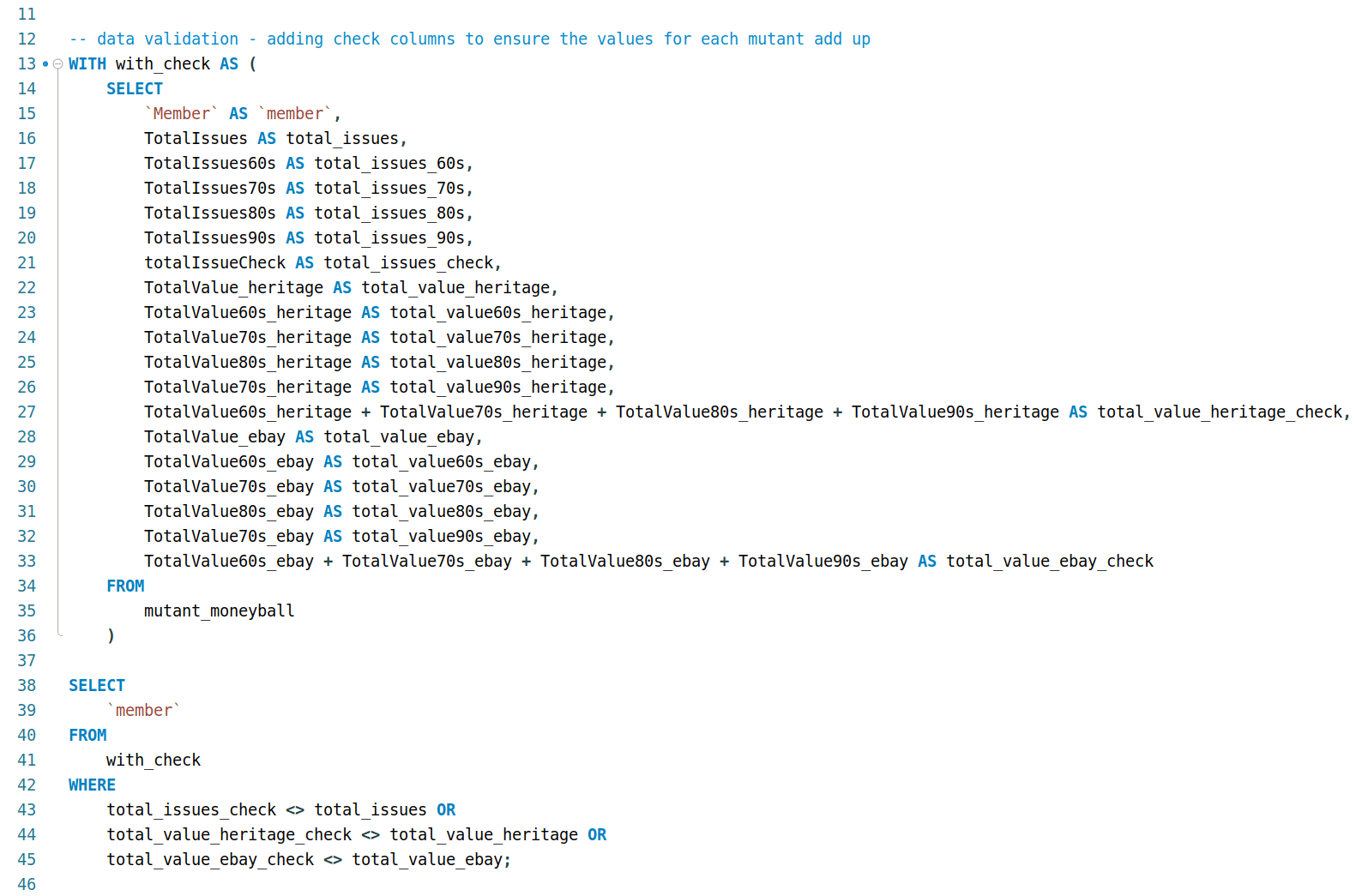
2.1 Cleaning and validation
Something I noticed while inspecting the columns is that some value columns were NUMERIC/INTEGER as expected, but other value columns were designated TEXT/STRING.
  DESCRIBE
        attribution_studies;
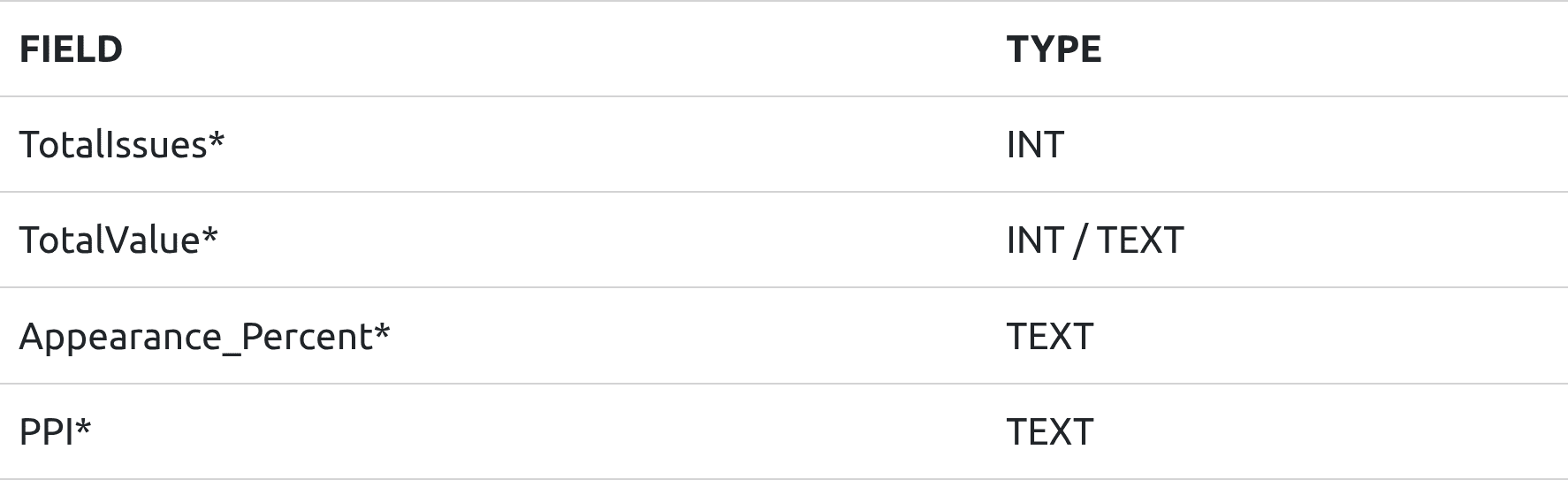
(* either some columns are TEXT and others INTEGERS, or A TEXT because of ‘$’ or ‘%’ symbols)
Before addressing this and moving on to the next step, I noticed that some of the values ended with “00” while other had either random digits or ended in the same two digits.
I needed to confirm whether columns were”
- whole dollar values (no cents)
- dollar values, with cents, but the comma/decimal was missing
- the contents of the column added up what the totals columns were showing
2.1.1 Cents, or non-cents?
Probably the most confusing part, at first. Luckily, the presence of the TotalValue_heritage and TotalValue_ebay columns allowed for checking that indeed revealed that some columns were whole dollar values, and others included cents.
Result set:

After verifying which was which, I dropped those totals columns for the remainder of the exploration.
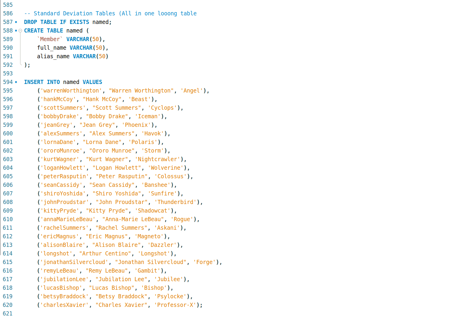
2.1.2 Making the data more familiar Introducing mutant aliases
I also wanted to make it a more fun/engaging exploration for myself (at first), so I did additional research into whom these names belonged to. Of course I was familiar with the likes of Charles Xavier and Jean Grey, but I learned, through this exercise, that Wolverine’s surname was Howlett (!!!).
Realising that I can’t be the only casual that might be interested in exploring the data that would benefit from the inclusion of more familiar identifiers, I collected mutant names and inserted them into the table:
2.1.3 Generating the cleaned table
This is the query I wrote to generate a table that:
- column names are all lowercase and consistent in format (subject > year > outlet)
- dropped columns that were now considered out-of-scope
- removed currency and percentage symbols to make values numeric
- replaced the comma in the values with a decimal point instead
- rounded dollar amounts to two decimal places to reflect ‘real’ money
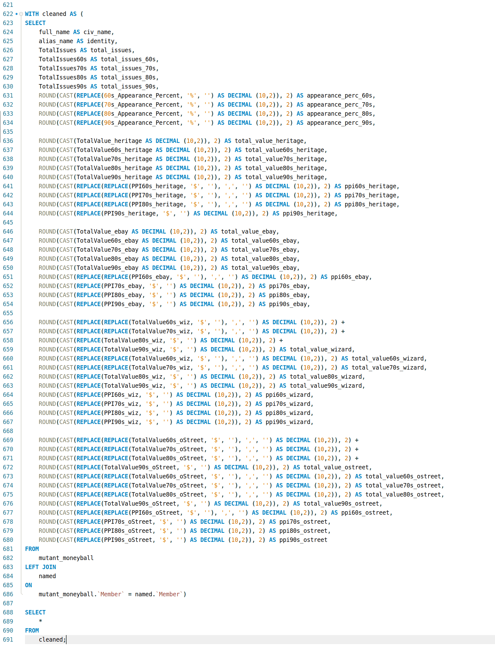
Apart from data cleaning and standardization, this also makes it easier to plug the data into things like dashboards that rely on established patterns to minimise spot-fixes/solutions to work with the data in cases like formatting and interactivity.
Result set (first few columns):
2.2 Importing cleaned data into RStudio for visualization
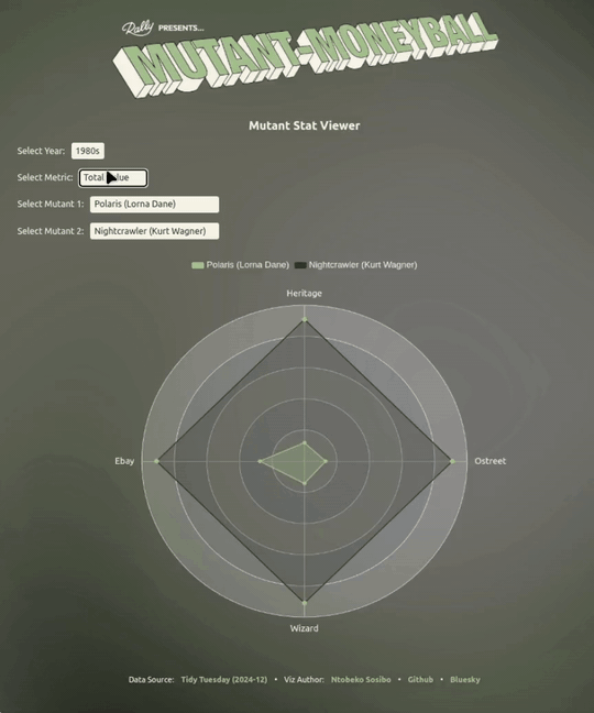
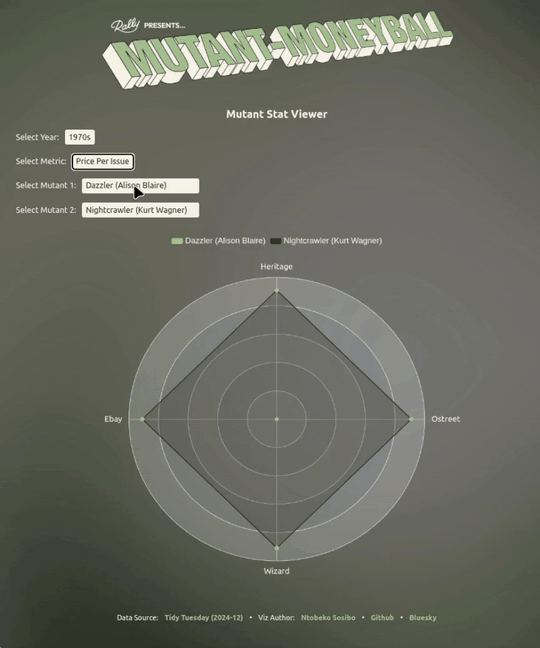
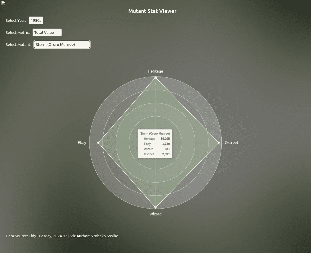
With the table cleaned, visualisation is the next step. Recently I’ve been making Quarto-friendly templates for ECharts4R and posting one weekly as a way of sharing what I learn, and a form of accountability. A benefit of this (and the timing) is that I had a radar chart template ready to be adapted that I thought would really suit this particular project.
2.2.1 Visualising central tendencies (abandoned driver)
Very early in this project, I had an idea to use central tendencies as an anchor to designate a class for each mutant depending on where they situated relative to a given central tendency.
Ultimately, I moved away from this being the main driver of the project because I didn’t really have a concrete view of what “the game” was. Scaling down to just wanting to get familiar with how each mutant compared with one another was insulated enough without having to worry too much about rules that could have been anything..
That’s a concern for when the game is finally defined and the rules of the environment/arena are made clear.

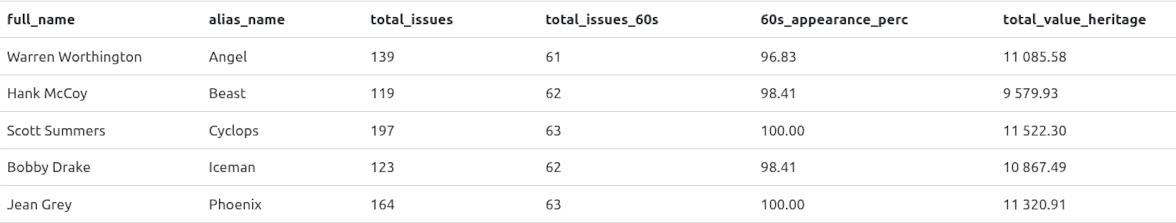
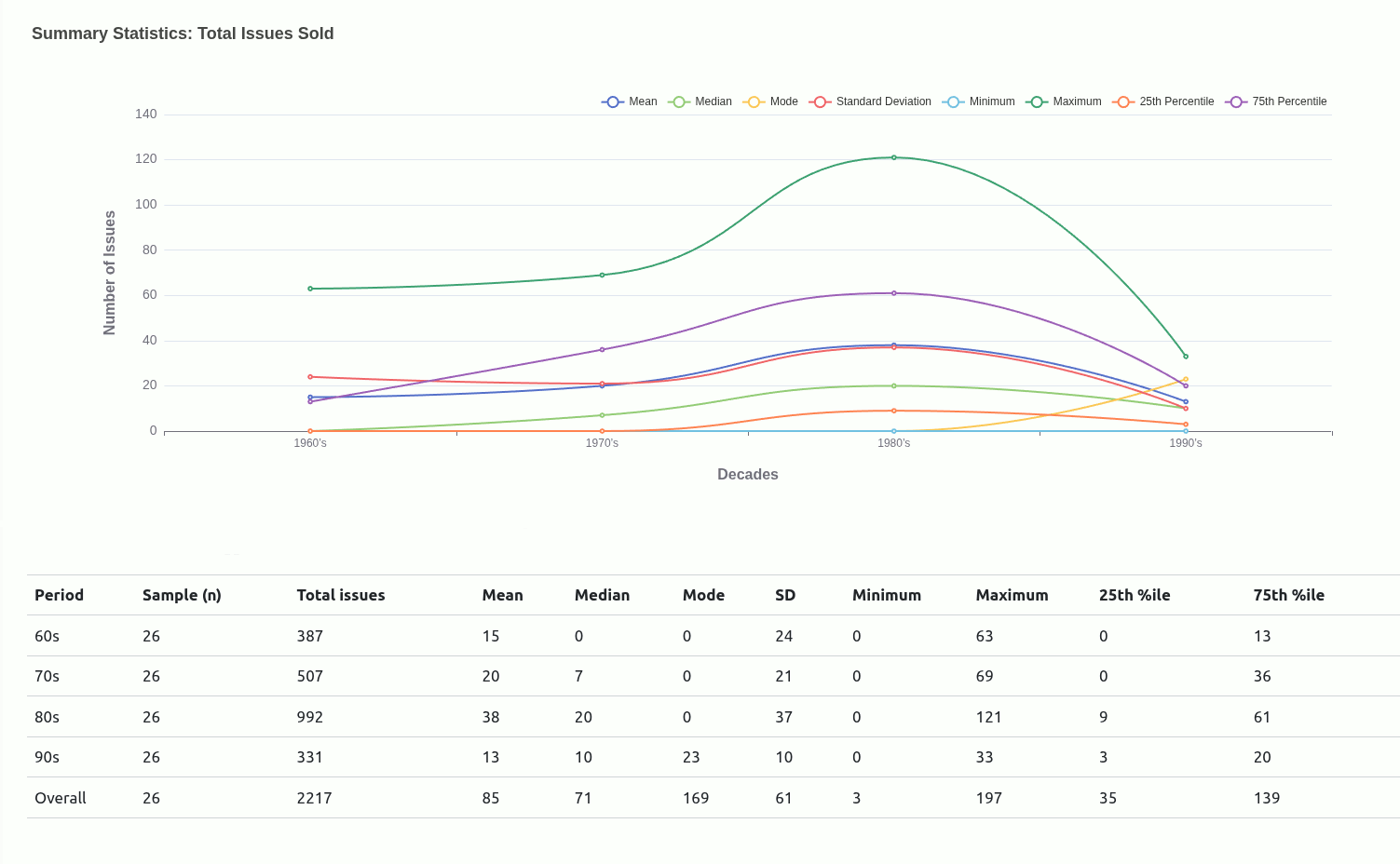
Because this entry is already quite long, I want to limit this section (important as it is) to what I think has been the highlight for me overall. Things like which mutant performed best in which outlet/decade, and what the most expensive issue price is will be covered in the project notebook/report once that’s done.
Right now, I’d like to share something I discovered/noticed when the tool was virtually complete and I was flexing it to see if there were and adjustments needed before calling the project done.
3. The Total Value x PPI Inversion
Something the visualisation does a nice job of pointing out is that a mutant having a relatively high total_value can have a lower ppi (price per issue) by comparison to another mutant, and vice versa.
This information can be useful in a multi-round situation where you’re either selecting for a total_value that’s not-so-high across the four outlets, but the ppi sits well above average - making it a good pick in ppi face-offs.
3.1 The extent of the Inversion
I was interested in seeing how prevalent this relationship is. One way to explore this was using the tool itself to read the graphs, jotting down the results, but I wanted to see if I could do this by plotting a graph to see if there really was a correlation between the two metrics.
Stated more concisely, I was asking,
“In a given decade and given outlet: If ‘mutant’ A has a higher total_value than ‘mutant B’, is ‘mutant A’ more likely to have a lower price-per-issue than ‘mutant B’?"
To answer that question, the task was divided into two parts:
- establishing whether the relationship really existed
- calculating the pairwise inversion rate
3.1.1 Computing the correlations
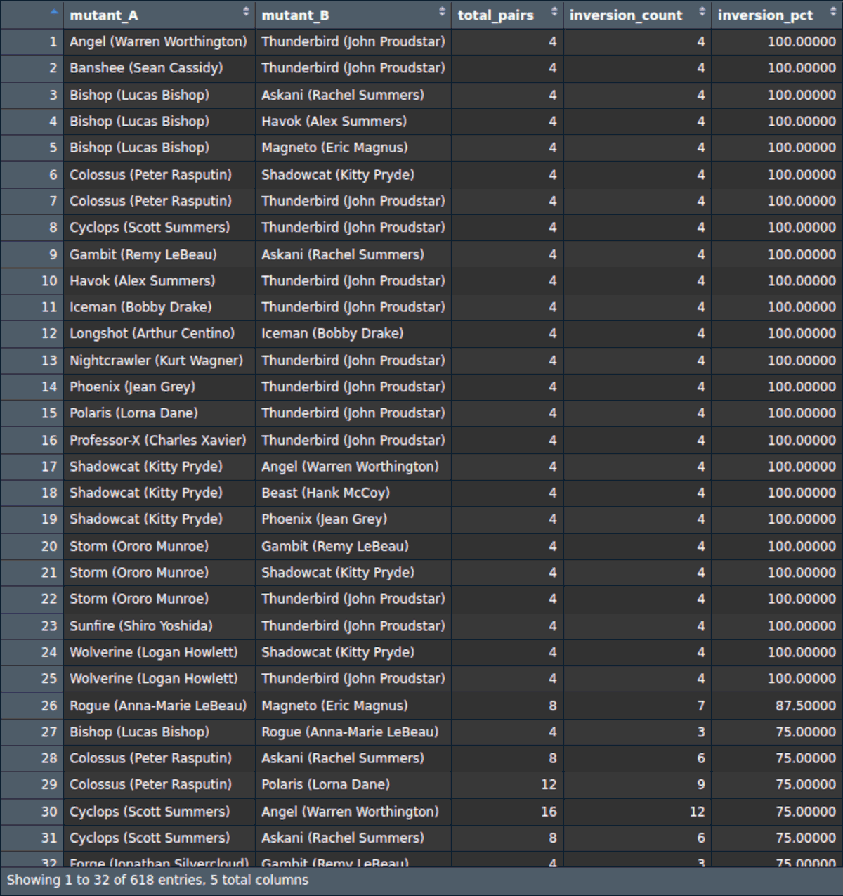
I used the sparlyr package to perform the pairwise comparison between every combination of mutants, generating a 10 000+ line table that could be the subject of a wide range of further explorations.
3.1.2 Creating the plot
Preparing the data to visualise the extent of this phenomenon first required taking the cleaned table that had been pivoted to a long shape to generate the radar charts, and pivoting it a little wider to get the total_value and ppi metrics into their own columns for convenience when the pairwise table is generated.
Below is the chunk that demonstrates this and also generates the table used to plot the line chart depicting the extent of the inversion:
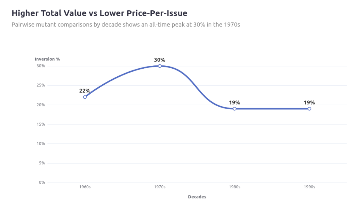
Overall, the inversion exists ~20–30% of the time when looking at a single line chart, so I looked at segmenting it by outlet to see if my observation may have been more specific to any in particular.
1-out-of-5 times is significant enough for this to be a consideration when building a roster, and looking at the first few rows of the full tables already shows that Thunderbird has the highest count of instances where he’ll have a higher ppi compared to mutants he’d be paired against.
I continued to generate the chart below to see if this was occurring consistently across the outlets:
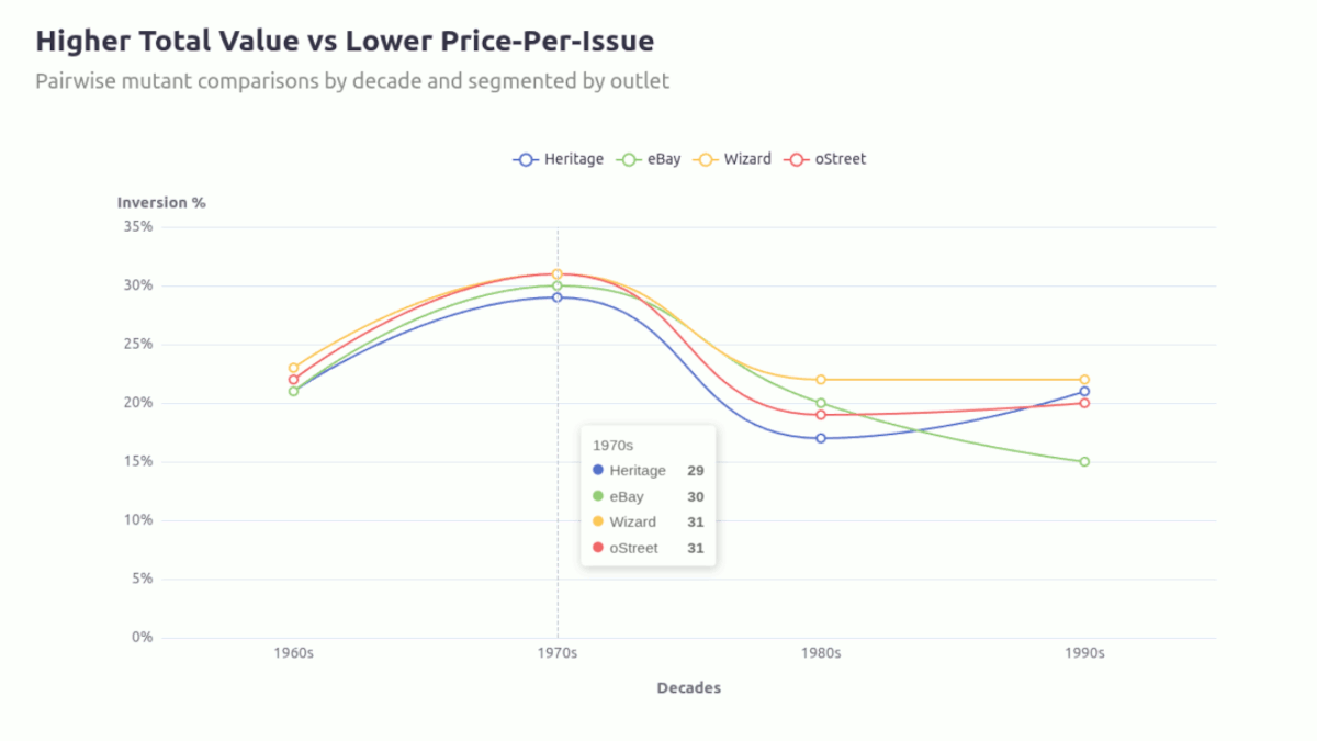
The inversion between total_value dominance and per-issue pricing is not uniform across outlets. It is most persistent in Wizard, weakens over time in Ebay, and remains relatively stable elsewhere. This is more an indication of outlet-specific pricing mechanics rather than a universal market inefficiency.

4. Develop the game
The more you tinker with the tool the higher the likelihood you may discover more patterns as I have with the common inverse relationship between the total revenue versus price-per-issue for each mutant across decades.
4.1 Focus on pair comparisons (for now)
Rather than looking at the Mutant Stats Viewer as a tool for making picks for a moneyball, I think it should rather be seen as a means for questioning potential “match-ups” chosen mutants may be involved in to see how they might fair under different conditions.
My approach going into this project was to look at this as an opportunity to see how far I could push my visualizations. There was a plan to make custom icons that would appear when the corresponding mutant was selected, giving it a video game character selector look, but I had greatly underestimated the mechanics just needed to get a dual radar of this complexity working. This would have been a “system within a system” problem I look forward to tackling in a future project.
As much as there was a project plan going into this, it still grew in some (..more than some..) ways, and this highlighted to me the importance of keeping/making broader project notes.
5. The need summarise/note pivots for my own peace of mind
There were many instances, particularly at the point when the tool transitioned from a single mutant viewer to a dual mutant comparison tool, where I was so focused on keeping the momentum going so intently that I didn’t take the time to internalise how big a shift it really was. So many old problems that had been solved now lo longer even feature, or the adaption is so much simpler because or reframing.
As I’m writing this report I often have to comb through all the different versions/formats the project data is housed in. Reading through some of them reminded me of some issues that were so all-encompassing at the time, to the point where they either needed to be solved or they would undermine the entire project. One such issue was scale (and its relativity) on each indicator of the radar chart.
5.1 A shift from historical truth to local truth
As you move from mapping a single mutant to an additional one for comparison, their revenue/total_value across the different outlets can vary quite drastically. Isolated to a static observation it isn’t too much of a problem, but this doesn’t an interactive tool make..
Angel being the first mutant on the list was helpful in many ways because it immediately highlighted a visualization issue related to values and how they’re scaled on a radar chart.
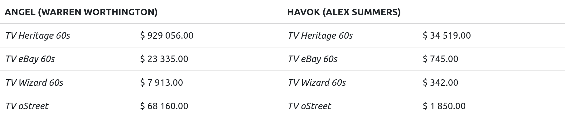
Built with vanilla ECharts4R, here’s a simple radar chart mapping Angel and Havok’s values:
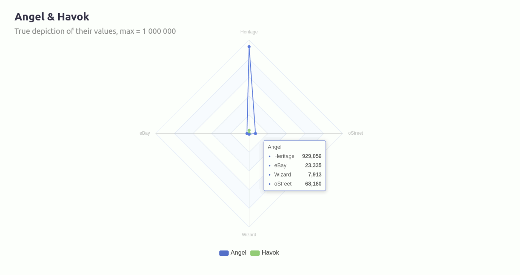
You can see how much that Heritage value throws the whole chart out of whack. The way I addressed this needed to evolve often as the tool took shape and increased in complexity.
5.2 A solution for a single mutant chart
Addressing the scaling issue started with a manual approach where I calculated the max values for each outlet over each decade and assigning that value to the appropriate indicators.
On one hand it solves the issue of the largest indicator implying its scale on the other three, but now ratio has been thrown off because of that very independence.
The graph above makes it look like Heritage and Wizard are similar in size, but the reality is that Heritage is nearly 11 times the size of Wizard.
This became is tougher issue to grapple with as I was introducing the second mutant selector, and it’s this transition where a problem necessitated a shift where I fell back on some of the behaviours of the chart and prioritised a more local/specific comparison rather than graphic accuracy.
5.3 Leaning into the relativity
Interactive viz libraries such as ECharts have this behaviours where toggling a variable on/off shifts the existing/remaining chart to occupy the space as though it has nothing else to consider. When a new entity does populate, the group adjusts/resizes to occupy the space relative to each other in size. This should be (and is) enough when comparing two mutants.
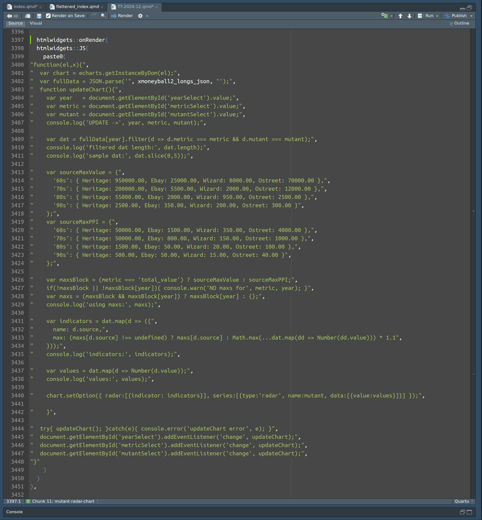
Here’s the updated onRender() chunk after introducing the second mutant:
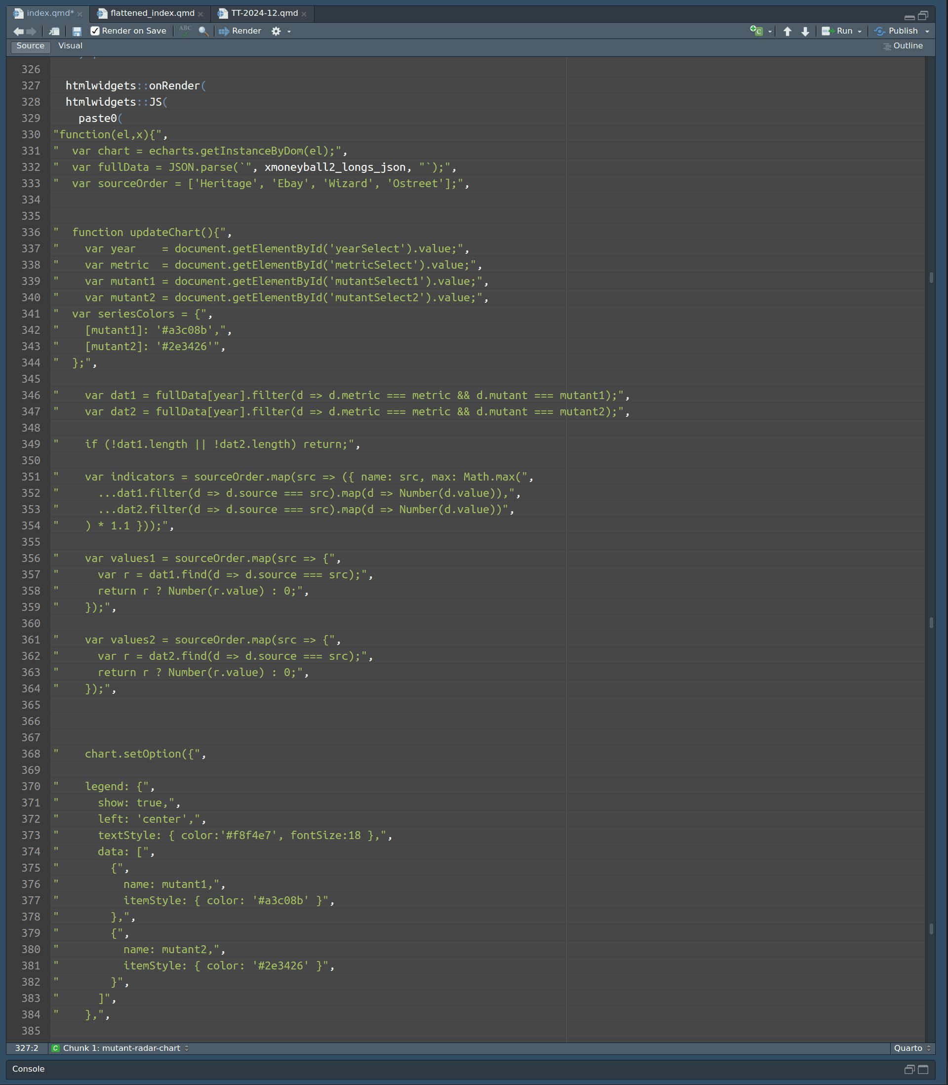
You’ll notice the lines referring to the indicators only introduce a buffer distance –
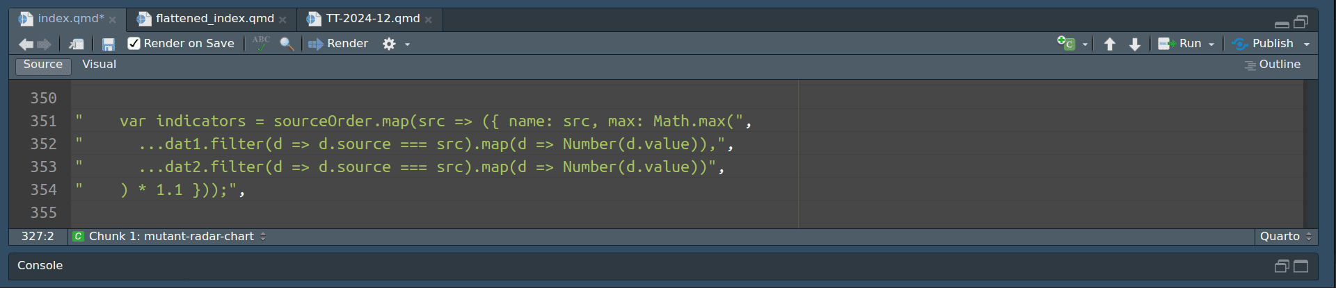
– so that the points don’t touch the edges. The charts follow default behaviour and adjust depending on the changing mutants, with the mutant with the highest values per indicator setting the benchmark for the maximum value of that indicator.
Less manual input, flexible, and presents an accurate representation of the comparison per indicator/outlet.
5.4 That’s it, for now
I’m making sure that the quarto file I’ve been using to record all of this work also includes the needed process and motivations - not only for the benefit of the reader, but for my future self too.
6. Circle back later?
The little discoveries I made towards the end of this project reignited an excitement to continue exploring. Some really interesting tables came out of the pairwise comparisons, and I think it further reinforces this other idea I had at the start about making this a narrative game rather than a straight-up brawl scenario. The data can create some unexpected prompts and the still ends up following the “lived” history of the X-Men comic books.
Tags
tidy tuesday
quarto
project report
portfolio project
mysql
cte
dataviz
data visualization
data exploration
data analysis
rstudio
javascript
html
css
machine learning
sparklyr
spearman correlation
echarts
echarts4r