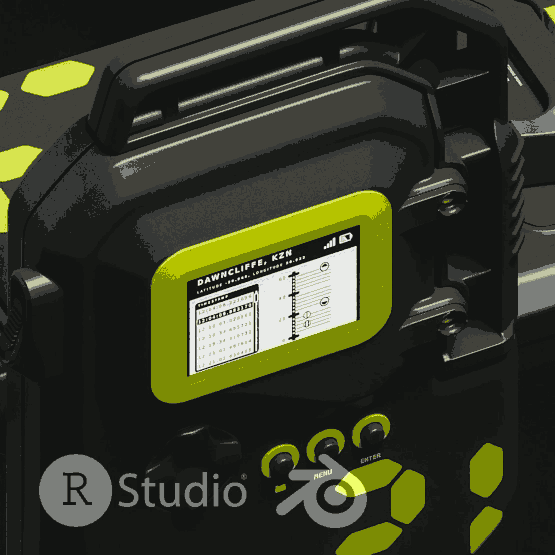
Sensor 21
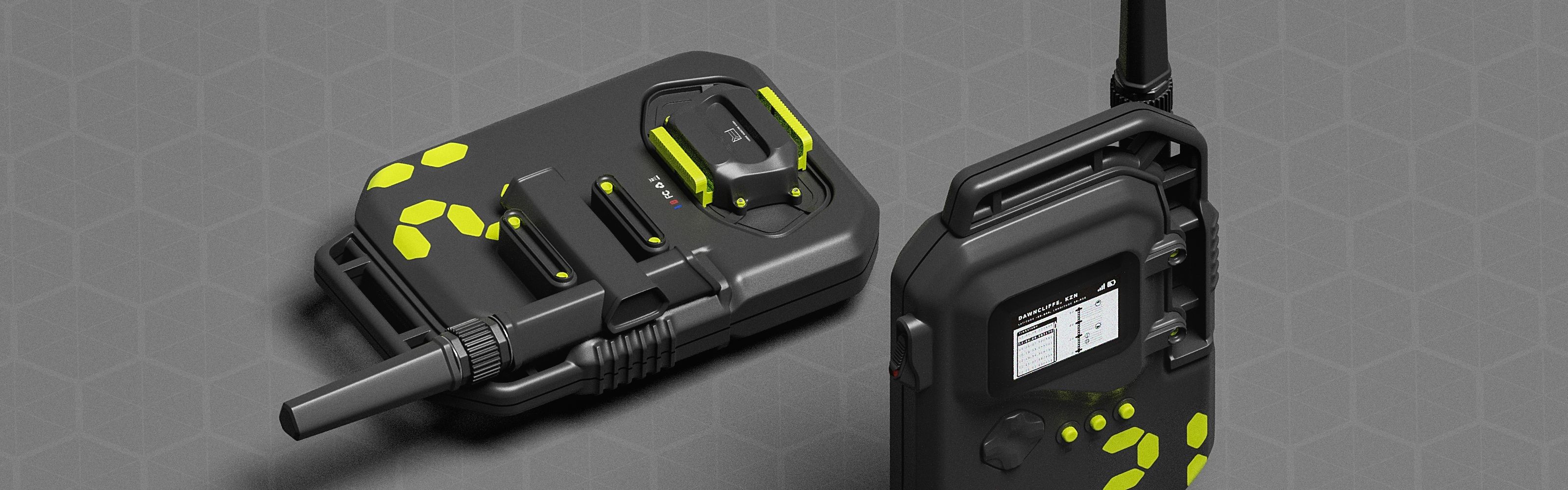
This was a quick study using a dataset of an air quality survey in Dawncliffe, Durban. It was conducted in 2018. The final product was an hypothetical electronic sensor device that could have been used in capturing/generating the data used in the exercise.
R Programming 101’s framework for exploratory data analysis covered in their series of videos was used to methodically interrogate the data .
The EDA started by downloading and bringing the dataset in to the project with the name “daq2018”.

3D Printing
#5

More cookie cutters - those will be a staple. Looking to get better at making flatpack designs. The Pochita design is picking up in terms of downloads and I’d like to get improve in the overall quality - down to the supports. This ended up with a cat design that didn’t work out, but did give an idea for something simpler.
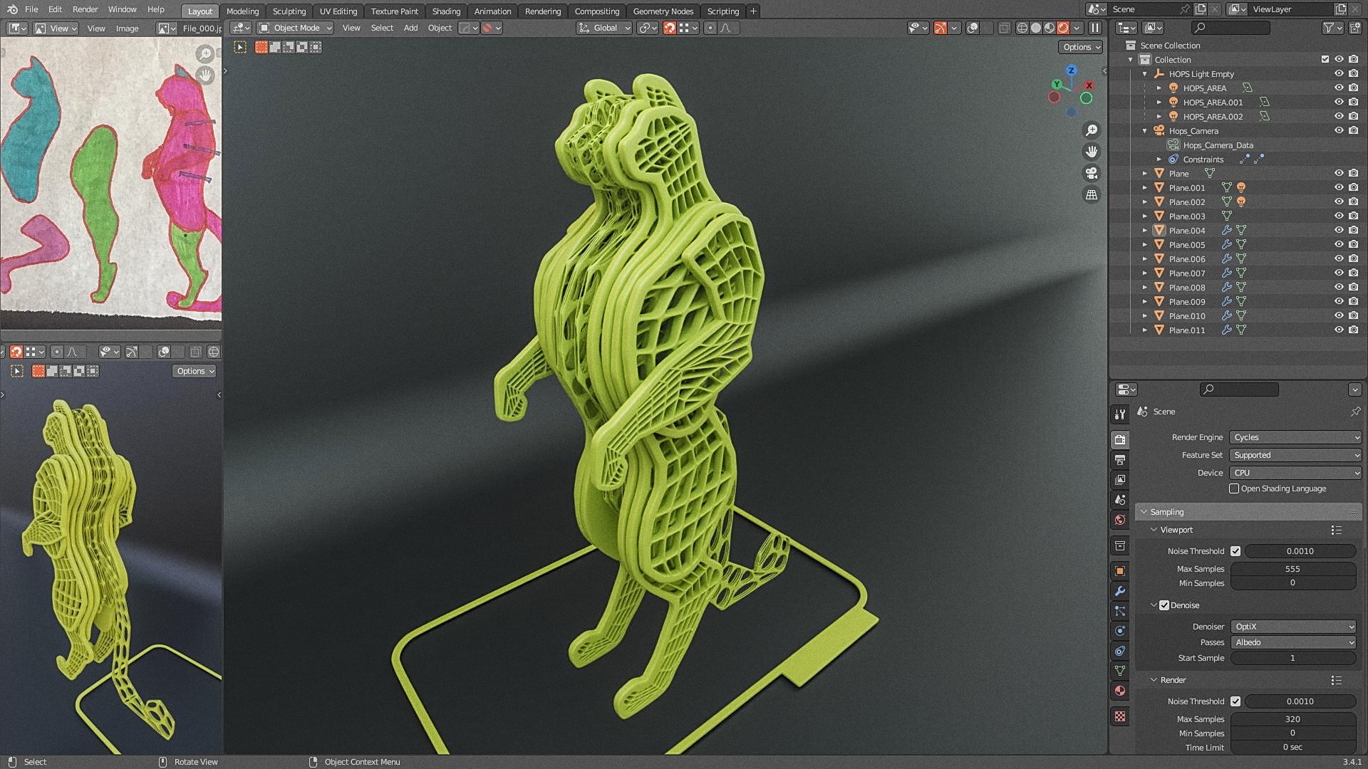
What this project told me is that I need t o learn to sculpt soon to get the most out of any kind of services I could offer in the space.

Drone Cinematography
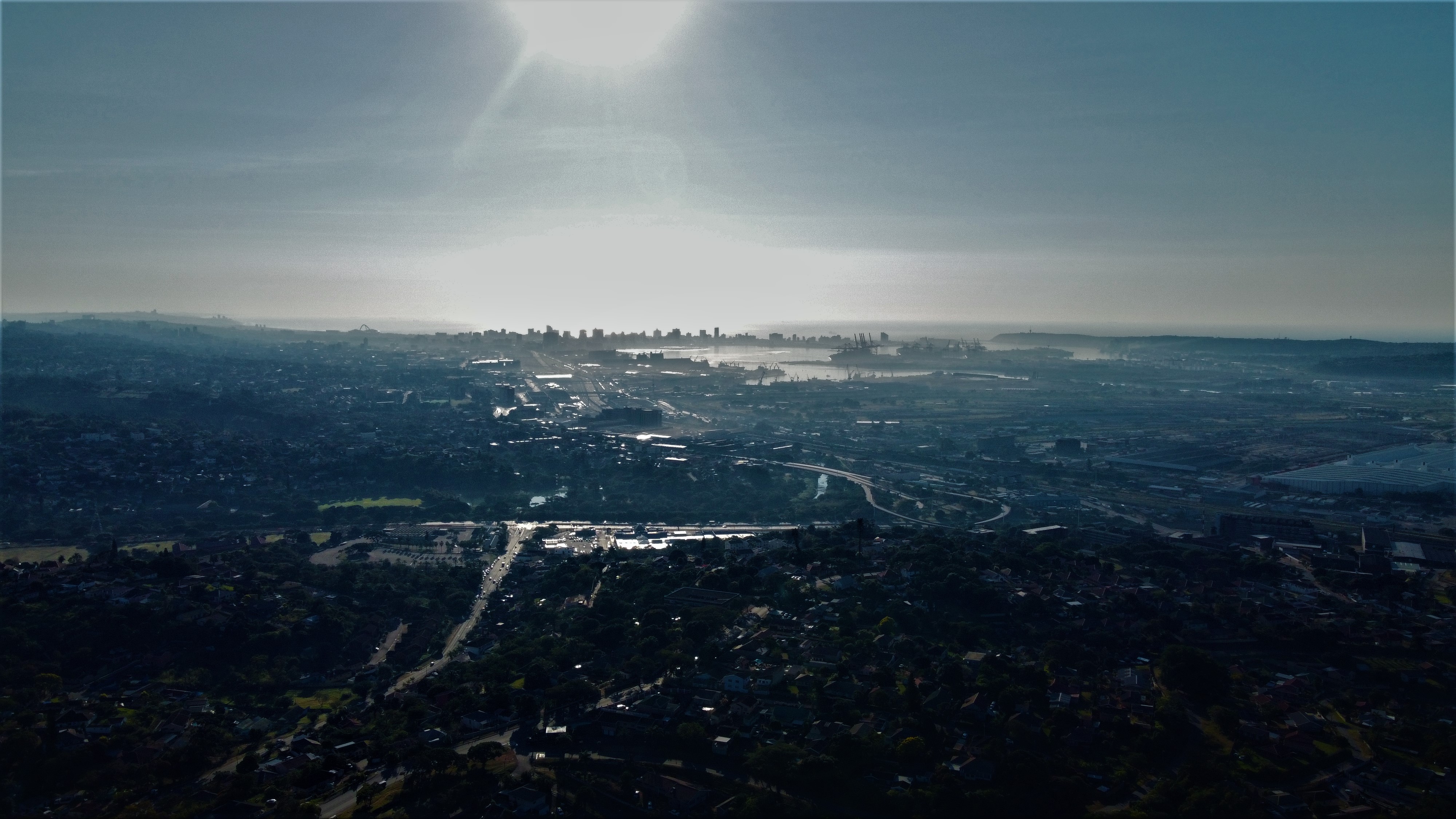
2019 marked the first full year of Afrikaniz3D. I was still mostly working on architectural projects. I bought a drone, the first generation DJI Mini. The timing of the COVID-19 pandemic delayed things “a bit” through various restrictions, but I’m happy that this gets to be part of the mix and look forward to seriously playing with it again.

Maven Hospital Challenge
| DESCRIPTION | Investigating Massachussetts General Hospital (MGH) patient/visitor data, and generate a reporting tool based on insights from the data |
| TOOLS | MySQL, RStudio, Shiny, Quarto, JavaScript, HTML, CSS, Blender 3D |
| PROJECT_TYPE | Data cleaning, Data analysis, Data visualization, Shiny app development, |
| LINKS | Maven Hospital Challenge , Dashboard , Github Repo |

FOTJ [Found on the Job]
This project came about during session working on the M4 retopo commission. There were many instances where I’d be zoomed-in working on a particular section for some time that started looking like the beginnings of other objects - like hallways, or a funky mechanical part.
I sat on the idea for a while till I could find the “right” polygons to build from..

X-Men Mutant Moneyball

| DESCRIPTION | Analysing comic book sales data to inform a moneyball draft for a team of mutants from the X-Men property |
| TOOLS | MySQL, RStudio, Quarto, JavaScript, HTML, CSS |
| PROJECT_TYPE | Data cleaning, Data manipulation, Data analysis, Data visualization, Trend Analysis, Machine Learning, Quarto Report Writing |
| LINKS | Tidy Tuesday 2024-12, Github Repo |

MTA Post-Covid Recovery Dashboard

| DESCRIPTION | Investigating an MTA ridership dataset to gain insight on the post-covid recovery trends of its various modes of public travel |
| TOOLS | Databricks SQL, RStudio, Shiny, Blender 3D |
| PROJECT_TYPE | Data cleaning, Data manipulation, Data analysis, Data visualization, Trend Analysis, Shiny dashboard development |
| LINKS | Maven Commuter Challenge, Dashboard, Github Repo |
Healthier Candy Choices for the Maven Halloween Challenge
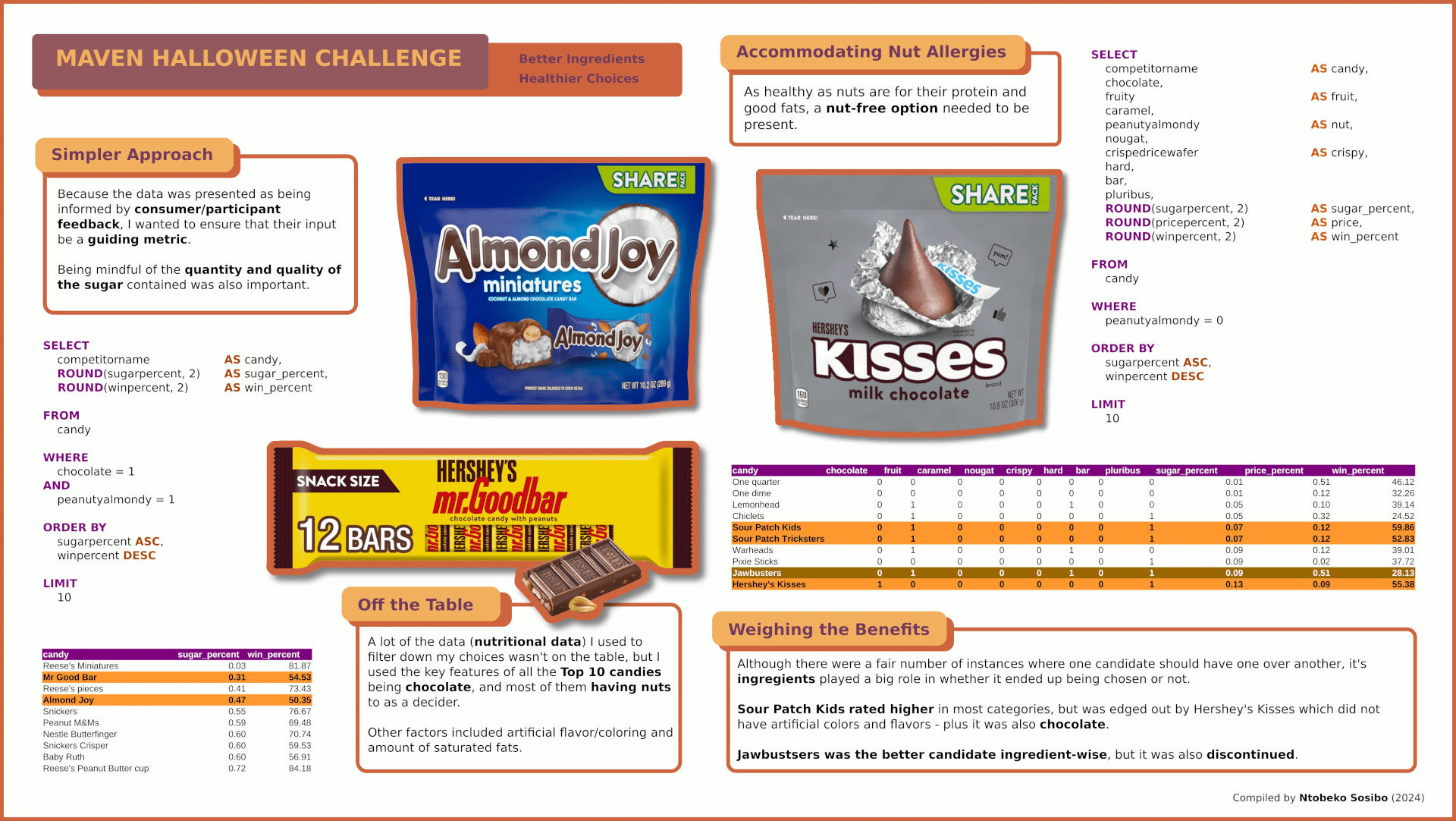
I already had an angle for where I wanted to take this project prior to looking at the data. The goal was to prioritize choosing the the healthier options coupled with them being the most popular according to respondent feedback - really simple, to the point where there were times I felt I was doing a disservice to the project and the data. I always find something an any EDA I do that has little to do with the outlined question but is still significant in some way. In this particular project I found that there were a number of name/ownership changes and some treats were even discontinued. This was possible because a lot of the work for this project happened outside the table due to the need for additional information.
Chocolate Survey Terminal
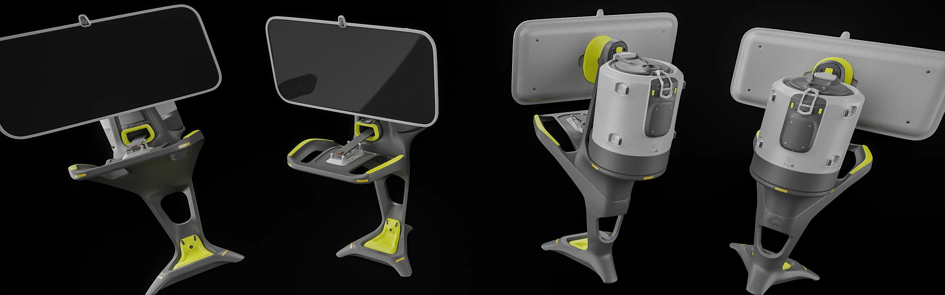
This EDA was inspired by a Tidy Tuesday dataset that looked at the ratings of different cacao been suppliers in different countries. Rather than following the original data challenge, I decided to instead focus on the elements that dealt with South Africa (SA) because my first real look at the data showed that SA had received the lowest ratings.
The hypothetical challenge I set for myself was to use the data to identify what led to the poor ratings as well as what changes would need to be made to improve future results.

M4
This was a client project I got some time back. The relationship with the client was a strange once, and it wouldn’t make sense to comment further as I think the whole experience itself was something else. I was no angel myself, but what I took away from it was a lot more than a new monitor.
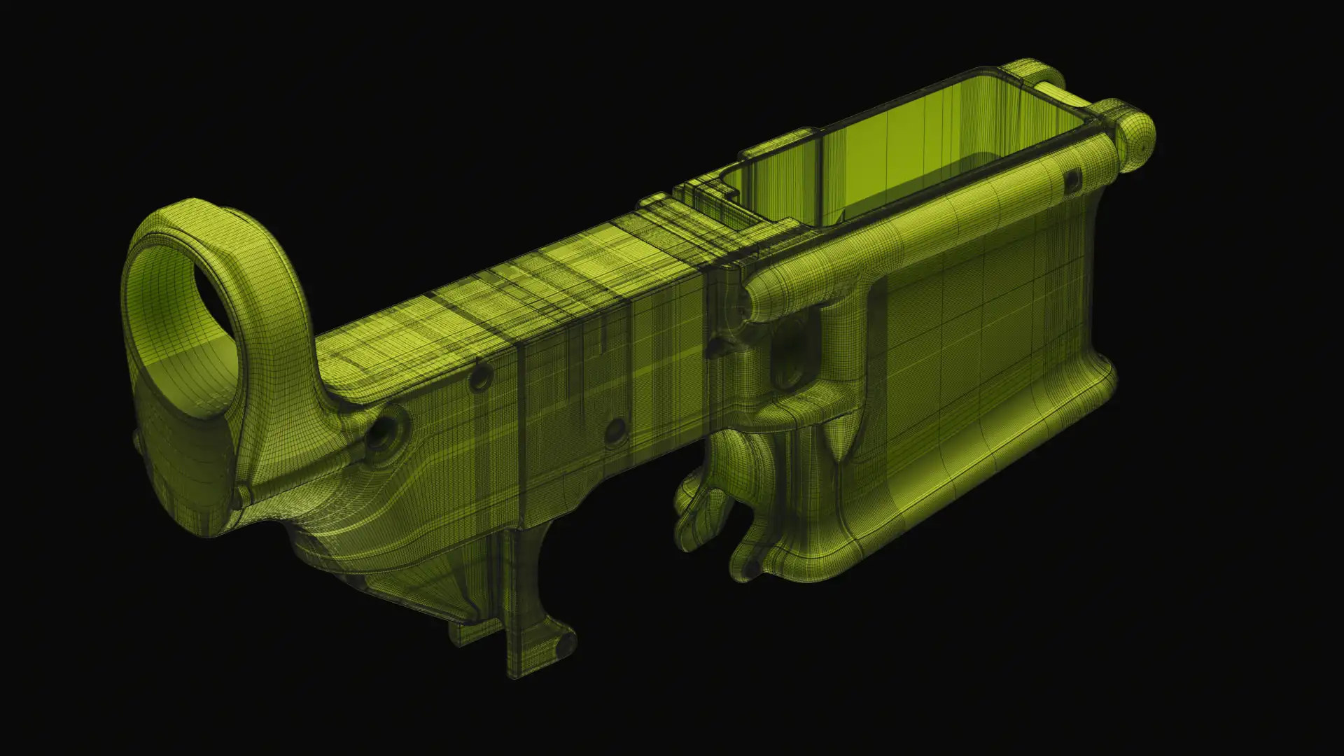
The first piece - the receiver - was easily the hardest. The big mistakes were:

BRAUBERRY
The Brand Mash-Up series was one of the first bigger projects on my YouTube channel that I started as a means of both expanding on what I had been doing as well as learning new tools such as Blender. The idea for BRAUBERRY was a response to the need for being careful when handling intellectual properties I didn’t own in the case they might endanger my YouTube channel. It was also a fun opportunity to see what could come about from merging two seemingly non-related brands.
HEXES Mini Pack Series
Forming a clear picture of the path to take towards a goal, something I am relearning, is affected by a variety of things, chief of which being that I find it difficult to push through a contrived/inauthentic path. Testing authenticity, I’m sure, has universally championed rubrics I’ll undoubtedly discover ahead now that the idea has been “committed to the bits.” How this ties to this project are the motivations that punctuated its creation. Rather than explaining things that can be gathered from careful observation, I’ve instead chosen to discuss the bits unrecorded, the unseen.
Renewable Energy in South Africa
The purpose of this data exploration is to apply and the practice the skills gained from the Google Data Analytics Professional Certification. The data being explored relates to South African energy, primarily electricity. This exercise will be replicated on other tools later on such as Power BI and SQL.
The datasets are mostly in .csv format and were collected from the following sources:
Eskom
World Bank
Energy Data
Regulatory Indicator for Sustainable Energy (RISE)
South African Government

Eskom Power BI Dashboard

This entry is related to South African energy exploration that on RStudio that you can look at here. My intentions for this segment of the exploration is to take the same data and generate some dashboards that you would find for up-to-date looks on some statistics - snapshots.
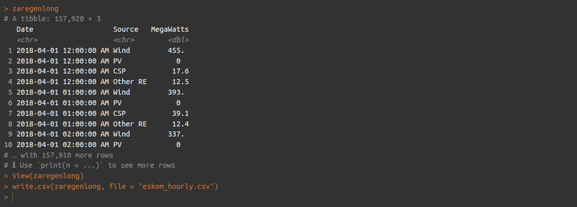
The dataset I wanted to look at was the one containing the hourly measurements of the different sources of renewable energy from ESKOM (“zaregenlong”) that was generated and exported from RStudio.