IELTS Scores
| DESCRIPTION | Creating a Shiny app that helps explore the 2022-2025 IELTS score data of the African nations using a simplified bucketing system. |
| TOOLS | RStudio, Shiny, Quarto, HTML, CSS |
| PROJECT_TYPE | Data manipulation, Data analysis, Data visualization |
| LINKS | Github Repo |
Goal
My goal for this (last) week’s dataset was simple: make a Shiny app, and figure out what having it on this site would look like in terms of getting it to work. I’ve made a variety of static and interactive presentations using Quarto in the past, but I haven’t explored Shiny yet.
Exploring Africa’s performance
I think I’ve already mentioned this in my Basotho Wool project, but something I enjoy about these’worldwide’ datasets is the opportunity to really focus down and not feel like you’re leaving data on the table. There are so many people that participate in Tidy Tuesday that also have their own interests/drives, that it makes it fun to see what everybody else chose to fixate on. I’d like to focus more on data pertaining to the continent as a form of rEpReSeNtAtIoN, but also as a way of getting to know a context closer to home.
Shiny development
I’ve also been meaning to do more Shiny projects. My Hospital Challenge project is missing that very piece to finally (…) be complete, and there’s a random image generator waiting to be made for my FOTJ project. What better way to procrastinate is there to learn something than to jump straight into it elsewhere???
There are so many cool instances on LinkedIn of widgets as substitutes for fully-fledged dashboards. I think this will be a fun skill to get some experience in.
Process
Because I knew I’d be making a widget for this week’s project, and that I wanted to show rankings using a bump chart function I made for my Birds Sightings at Sea submission. the data needed to be simplified down to a smaller number of subjects to avoid them squashing against each other when the visuals generated.
Data Inspection
I looked through the performance tables to first see the nationalities - of which there were many, so it’s really nice to be able to immediately reduce 58 subjects to just 12:
Nations participating
unique(performance_by_nationality$nationality)
 [1] "Azerbaijan"                "Bangladesh"                "Cambodia"
 [4] "China"                     "Colombia"                  "Egypt"
 [7] "France"                    "Germany"                   "Ghana"
[10] "Hong Kong"                 "India"                     "Indonesia"
[13] "Iran, Islamic Republic of" "Italy"                     "Japan"
[16] "Jordan"                    "Kazakhstan"                "Kenya"
[19] "Korea, Republic of"        "Kuwait"                    "Malaysia"
[22] "Mexico"                    "Mongolia"                  "Myanmar"
[25] "Nepal"                     "Nigeria"                   "Oman"
[28] "Pakistan"                  "Philippines"               "Russian Federation"
[31] "Saudi Arabia"              "Spain"                     "Sri Lanka"
[34] "Taiwan"                    "Thailand"                  "Turkey"
[37] "Ukraine"                   "United Arab Emirates"      "Uzbekistan"
[40] "Vietnam"                   "Algeria"                   "Argentina"
[43] "Brazil"                    "Cameroon"                  "Chile"
[46] "Mauritius"                 "Peru"                      "South Africa"
[49] "United States of America"  "Zimbabwe"                  "Lebanon"
[52] "Morocco"                   "Tunisia"                   "Uganda"
[55] "Bhutan"                    "Hong Kong, SAR of China"   "Iran"
[58] "Qatar"
Which of these are on the African continent?
I downloaded Steve Withington’s Country and Codes List csv and joined it to the demo tables, filtering for only the records pertaining to the African continent:
> unique(african_demo$nationality)
 [1] "Egypt"        "Ghana"        "Kenya"        "Nigeria"      "Algeria"      "Cameroon"     "Mauritius"
 [8] "South Africa" "Zimbabwe"     "Morocco"      "Tunisia"      "Uganda"
The country name conventions were throwing some NAs
There are many tables online that hold the country name and ISO code data. I’ve found that the way they name the countries differ, leading to joins producing NA rows. Being able to use the different ISO codes allowed me to bypass that big task I almost set upon to create a grand table the encompassed all options.. At least in the immediate future.
Filtering down
I created the african_performace table as the first step of filtration:
african_performance <- performance_by_nationality |>
  left_join(unified_country_clean, by = c("nationality" = "country_common")) |>
  filter(Continent_Name == "Africa") |>
  mutate(
    year_nr = case_when(
      `year` == "2022-2023" ~ 1,
      `year` == "2023-2024" ~ 2,
      TRUE ~ 3
      ),
    ) |>
  select(
    nation = nationality,
    nation_code = iso3,
    type,
    part,
    score,
    `year`,
    year_nr
    )
Then, I added added ranking data to place each of the twelve nations on a rung in each of the five categories (Overall being the fifth):
ranked_african_performance <- african_performance |>
  group_by(type, part, year_nr) |>
  mutate(nation_rank = row_number(desc(score))) |>
  ungroup()
With the table now generated, the next step was to begin my Frankesteinification of my older projects by repurposing them for this context.
Stitching together
The project that did most of the heavy lifting was my Birds Sightings at Sea project where I learned what a Sigmoid Curve was in my quest to replicate the beautiful charts created by the ggbump package.
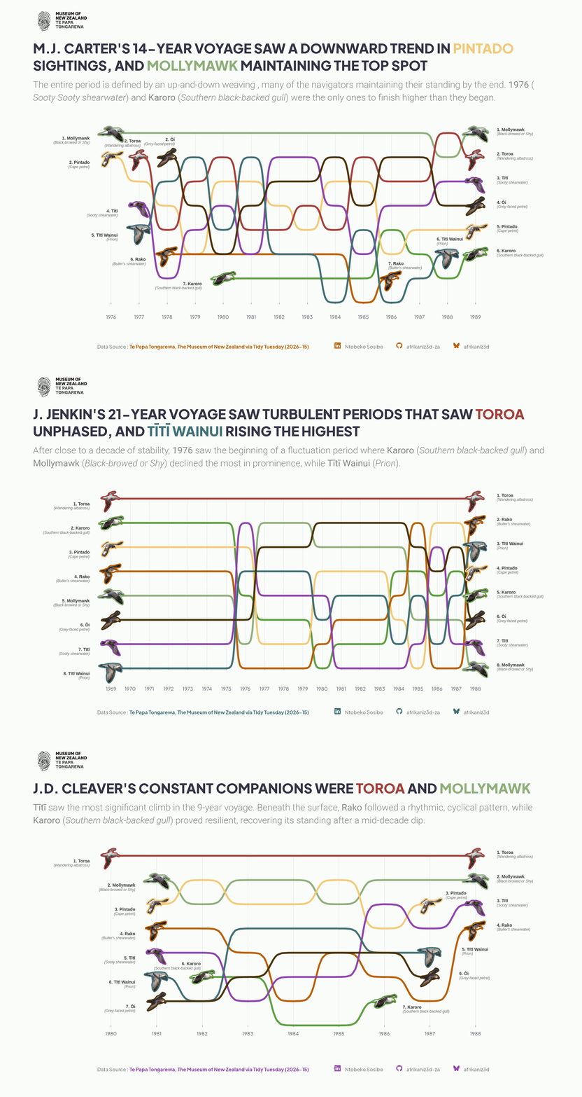
Echarts4r doesn’t have a native e_bump() function (yet), so testing out my “finnessed” workflow will hopefully contribute to its realisation in the future.
Specific table structure
The “finessing” of a table is essentially a system I came up with to shape the table in such a way that there are enough ‘hooks’ at the right place for the control points to generate the desired shape. Below is the function as well as an example of it being used:
# The finessing function
finesse_sigmoid_data <- function(data, steepness = 12) {
  data |>
    group_by(nation) |>
    arrange(year_nr) |>
    # Using nation_rank
    mutate(next_rank = lead(nation_rank)) |>
    filter(!is.na(next_rank)) |>
    group_split() |>
    map_df(~{
      nation_name <- .x$nation[1]

      map_df(1:(nrow(.x)), function(i) {
        current_yr <- .x$year_nr[i]
        start_r    <- .x$nation_rank[i]
        end_r      <- .x$next_rank[i]

        tibble(
          nation = nation_name,
          year_fine = seq(current_yr, current_yr + 0.9, by = 0.1)
        ) |>
          mutate(
            rank_fine = if(start_r == end_r) {
              start_r
            } else {
              start_r + (end_r - start_r) / (1 + exp(-steepness * ((year_fine - current_yr) - 0.5)))
            }
          )
      })
    }) |>
    bind_rows(
      data |>
        group_by(nation) |>
        filter(year_nr == max(year_nr)) |>
        rename(year_fine = year_nr, rank_fine = nation_rank) |>
        select(nation, year_fine, rank_fine)
    )
}

# Finessing the table
africa_finessed <- ranked_african_performance |>
  finesse_sigmoid_data(steepness = 15)
What this has done is introduced 9 intermediate steps between each point on each axis, creating a grid, for each control point that will fit the sigmoid shape. That table is in my repo for anyone who wants to see the result - repo link at the top of this page.
Matching the vibe
I’ve always had a vain… indifference to the base Shiny ‘look’, and I really loved the polished look of an html-css-heavy app. I have a massive Pinterest collection of dashboard and widget designs I want to get good at replicating, particularly the Bento Grid apps.
Design language
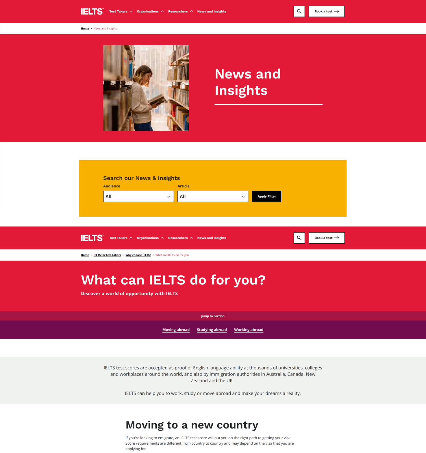
I took a lot of inspiration from the IELTS webpage, noting colours and buttons.
Bucketing down
Twelve subjects, as stated earlier is much easier to handle than 58, but they create an issue for me around there being too many colours to represent each one uniquely. Even though there is a decent selection of colour on the site, I still wanted to reduce things further.
One of my favourite things to do in data projects is to abstract things further down using buckets and thresholding. For me, this makes it’s less about a specific figure and more about what can be done (if anything) with that information. This also gives me more control to define how many colours I want present, as well as focus the narrative by reducing the possible questions one could ask because some of the options would indicate no need to act.
I chose to label the four buckets as:
- Soaring: rose by 2 or more ranks overall
- Progressed: rose by a single rank overall
- Steady: maintained the rank they started with
- Needs Motivation: fell by a rank or more by the end
mutate(
        start_rk = nation_rank[year_nr == min(year_nr)],
        end_rk   = nation_rank[year_nr == max(year_nr)],
        rank_delta = start_rk - end_rk, # Positive = climbed ranks
        trajectory = case_when(
          rank_delta >= 2  ~ "Soaring",
          rank_delta == 1  ~ "Progressed",
          rank_delta == 0  ~ "Steady",
          rank_delta < 0   ~ "Needs Motivation"
        )
      )
The colour palette above is what I settled on. The widget was no lover overly-colourful. You only needed to hold 4 colours and their meanings in your mind while you perused the tabs.
Adding the Shiny workflow
I’ve gotten so used Quarto and it’s interactivity-ready ecosystem, that I wasn’t ready for the realisation that the shiny app that I’d made would be clashing with the static nature of my site. The app would render as a static image rather than as a usable app.
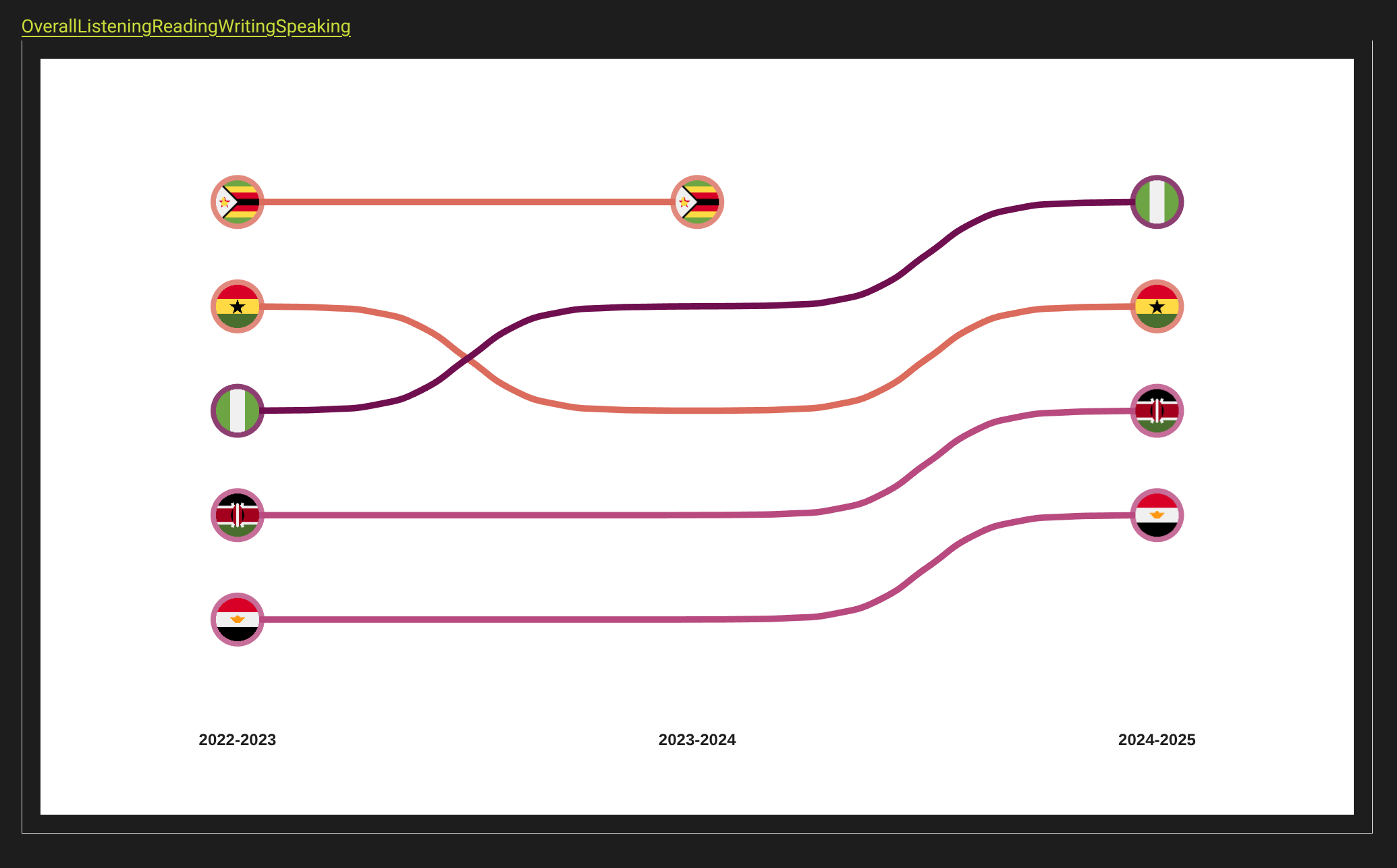
so that moved me back onto ShinyApps.io, where I’d embed the working app from as an iframe on the site. The process was really easy, and it looks great on the site.
Final Presentation
Reflecting
This was a great dipping-of-the-toe into shiny development, making the kind of app I want to get really good at making. it was also great extending that to having some of that hosted on another platform and embedding. I’ll definitely try to prioritise making a shiny app for future projects where possible - practice is needed.